01 — THE IDEA
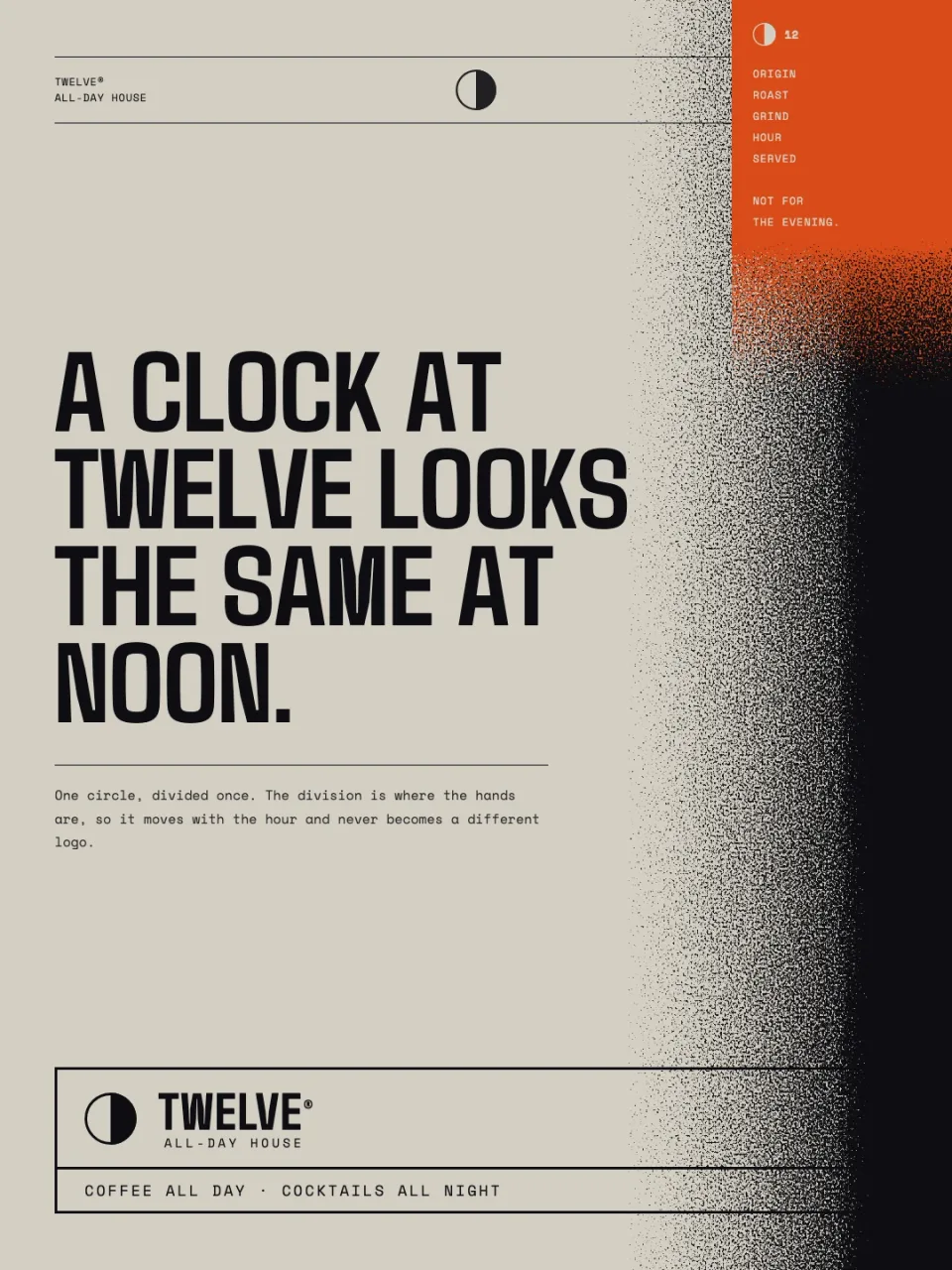
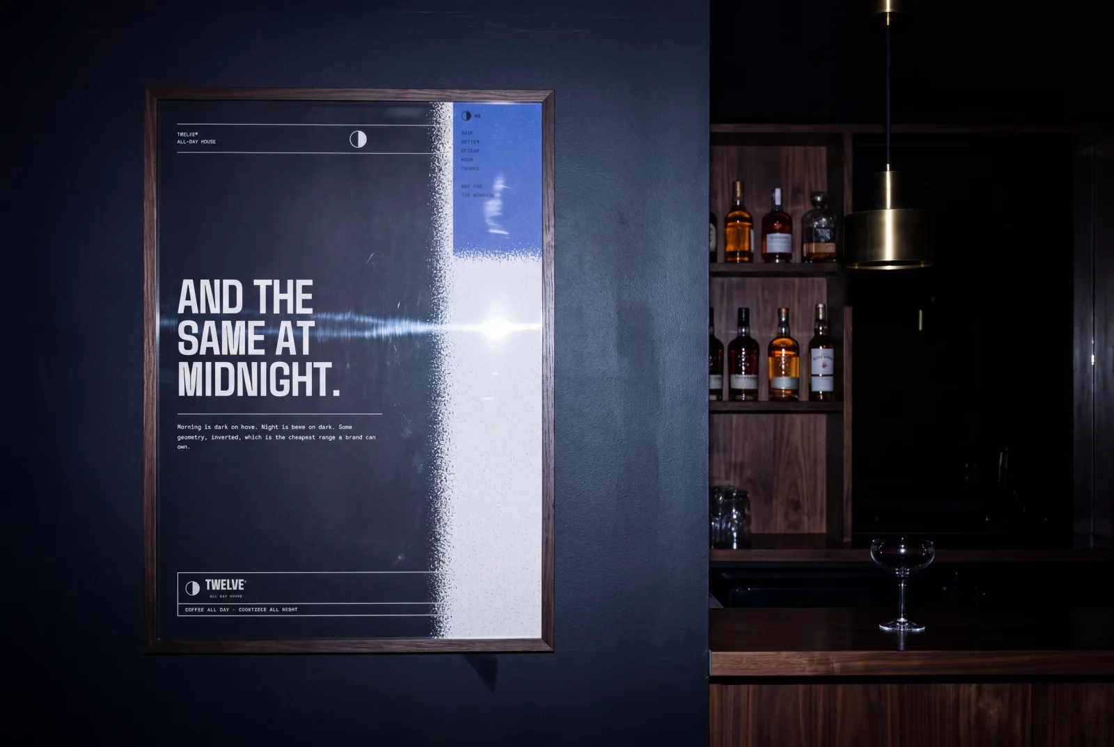
A clock at twelve looks the same at noon and at midnight.
One space, two moods, and no second identity to pay for. The mark is a single circle divided once. The division is where the hands are, so it moves with the hour and never becomes a different logo. Morning is dark on bone; night is bone on dark. Same geometry, inverted, the cheapest range a brand can own and the easiest thing to hand over.
The same face. Twice a day.
03 — CONSTRUCTION
Everything measured from M.
M is the diameter of the mark. Every gap and size is a fraction of it, so the lockup rebuilds correctly at any scale and a franchisee with a ruler cannot get it wrong.
STACKED · cap M×0.4009, gap M×0.1367
HORIZONTAL · cap M×0.6015, gap M×0.2433
DAY
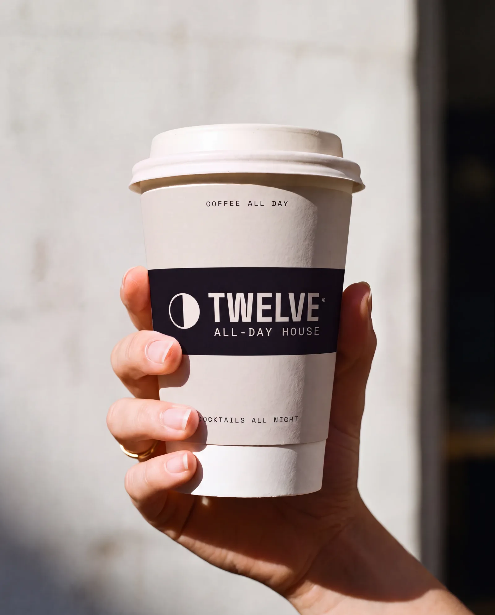
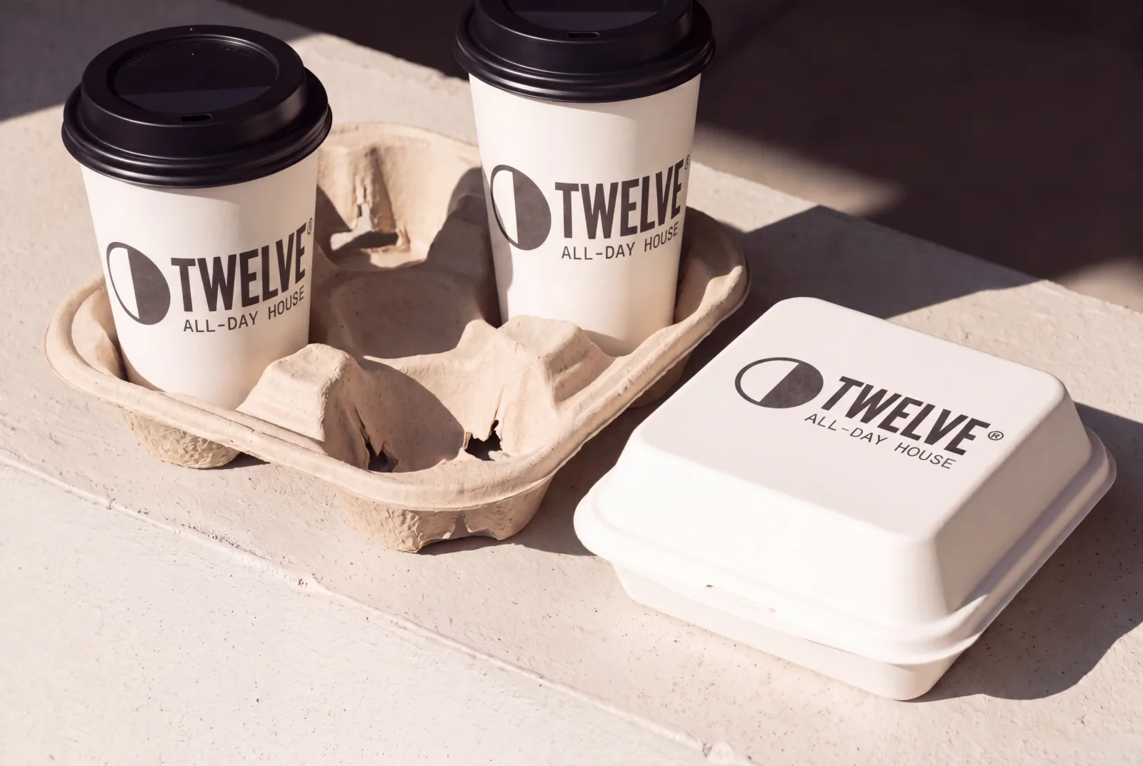
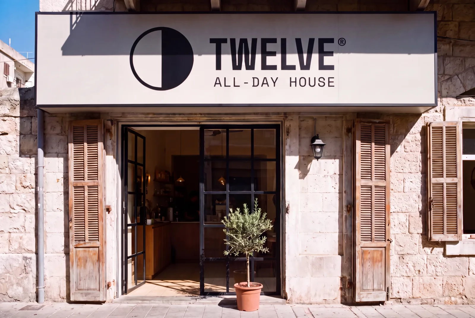
Filter, a counter you stand at, and a room that is mostly light. Dark mark on bone, amber for anything that has to be found across the room.
05 — THE MENU
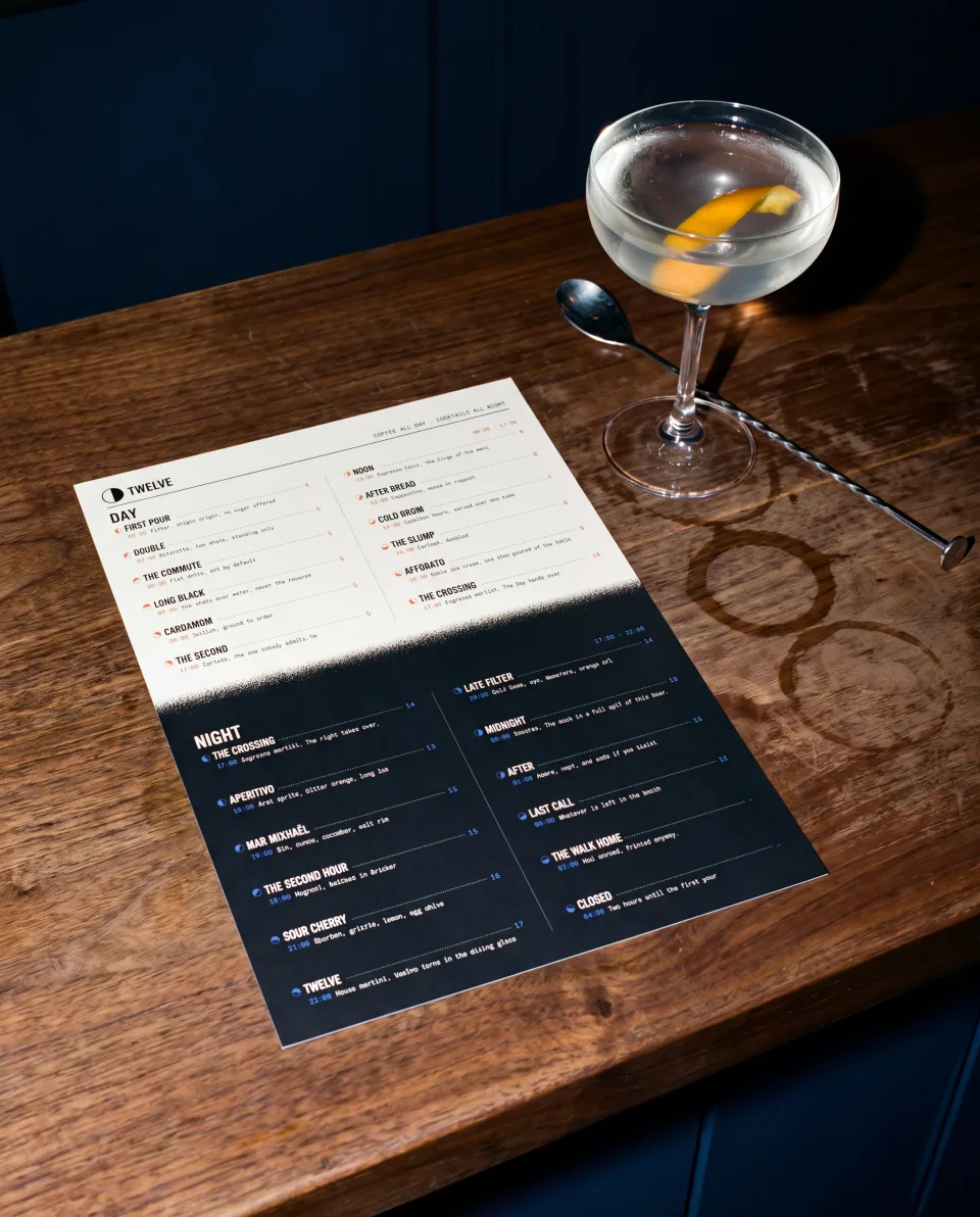
One card. It crosses too.
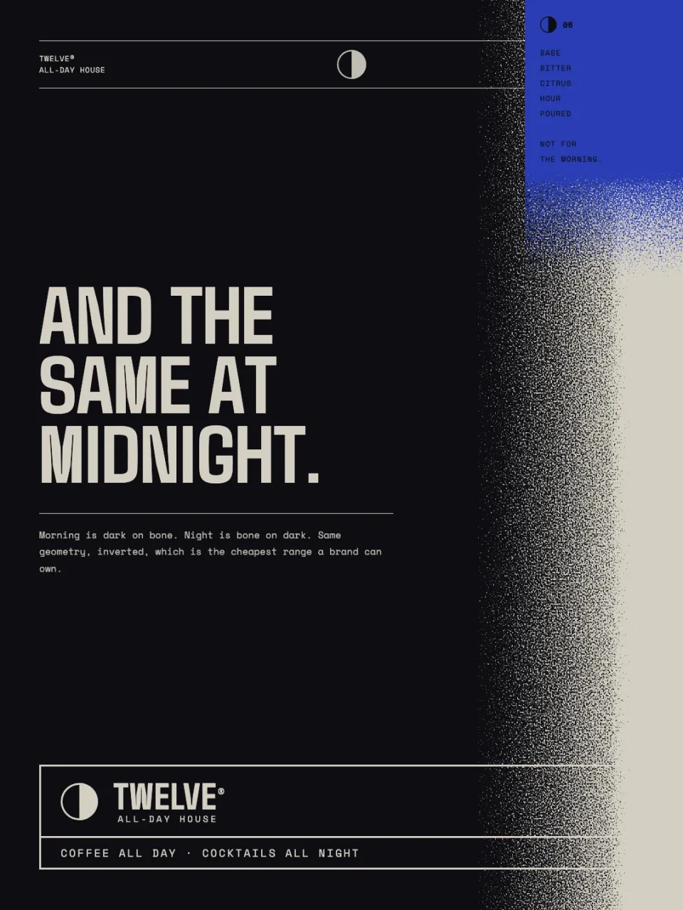
Every line carries the mark turned to its own hour, so the list reads as a day passing rather than as a price list. The obvious answer was two cards. This is a place whose whole proposition is that it is the same room at both hours, so it is one A4 sheet: day above, the spray through the middle, night below.

NIGHT
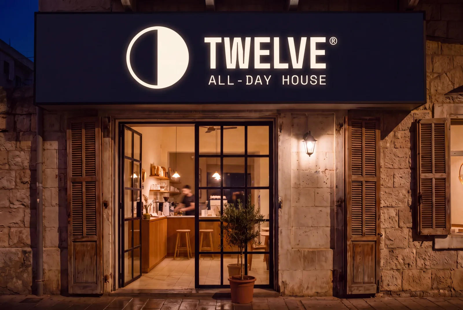
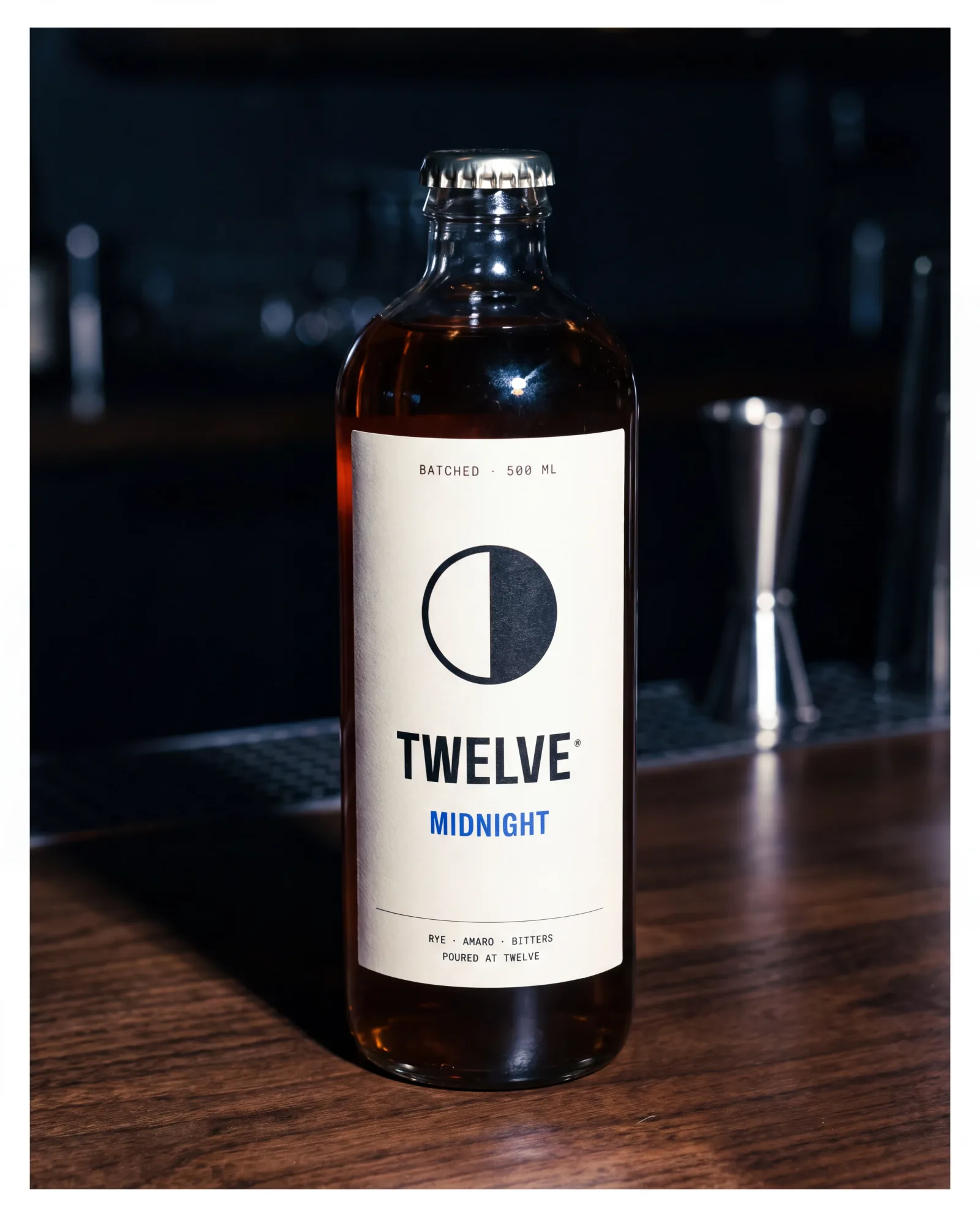
Batched cocktails, one light over the backbar, and a room that is mostly dark. Bone mark on ink, indigo where amber was. Nothing was redrawn.
SYSTEM
Everything above this line is the brand in a room. Everything below it is the four things a second site is actually handed.
08 — THE HOURS
Twelve marks, and only one of them is drawn.
The variable layer, shown as what it is. Morning hours take amber and evening hours take indigo, as a rule rather than an alternation, so a franchisee choosing a colour for a new cup cannot get it wrong.
- 01
- 02
- 03
- 04
- 05
- 06
- 07
- 08
- 09
- 10
- 11
- 12
09 — TYPE
One display face. One mono. Nothing else.
Caps only, tracking +4, the L to V pair pulled to −3. The wordmark, the hour numerals, nothing else.
Menus, signage, allergens, opening hours. Everything a stranger reads in a hurry.
Times, prices, the hour stamp. The only place numerals are allowed to be decorative.
10 — COLOUR
Two grounds and one accent, chosen by the hour.
11 — PATTERN
The repeat never repeats inside twelve steps.
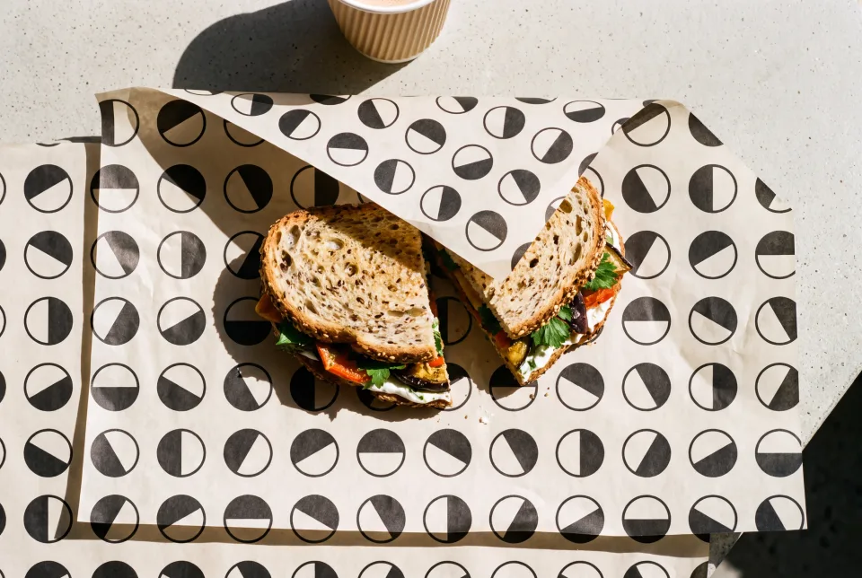
Twelve rotations tiled in sequence, so the eye finds rhythm without finding a seam. One row is the whole file. Everything under it is that row again.
- 01
- 02
- 03
- 04
- 05
- 06
- 07
- 08
- 09
- 10
- 11
- 12
12 — APPLIED
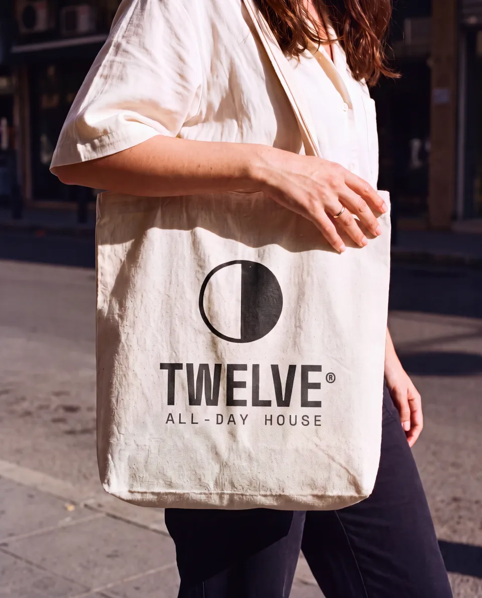
Everything a second site would be handed.
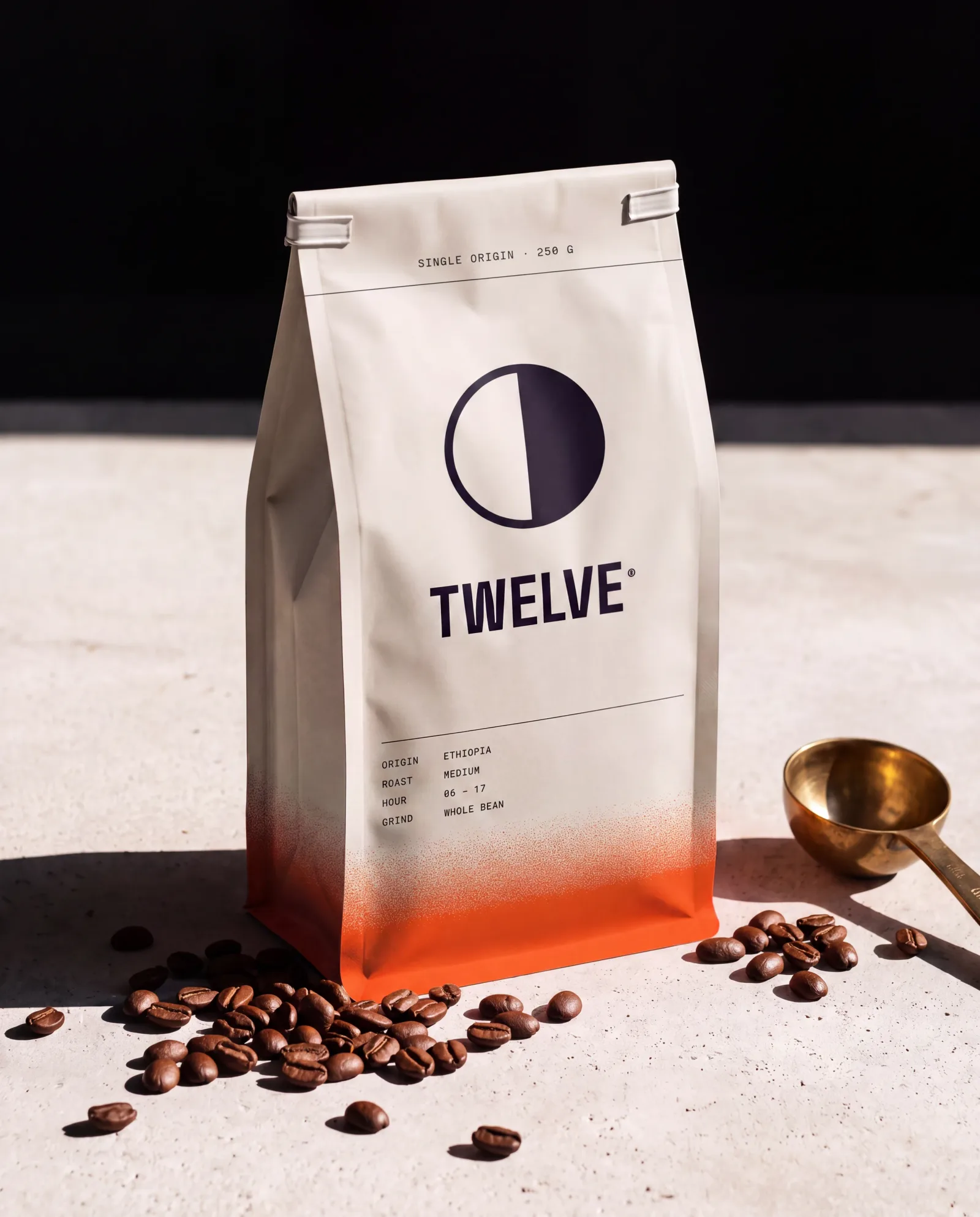
A franchise does not buy a photograph of the first shop to copy. It buys a drawing, a colour, a stroke width and a rule about the hour, and everything below is built from exactly those four things.
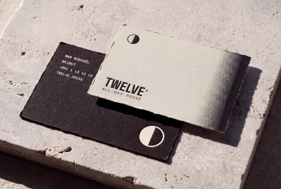
ONE DIVISION
One vector. Every other size is this file scaled, never redrawn.
Four values. Amber runs 01 to 06, indigo 07 to 12, by the hour.
Five percent of the diameter, at every size. Not a point value.
The solid half is the hour that has happened. That is the whole rule.
هوية بصرية لتِوِلف، مقهى نهاراً وبار كوكتيل ليلاً: دائرة واحدة مقسومة مرة واحدة، ويدور خط القسمة مع الساعة، فيدير المكانُ نفسه بعلامة واحدة بدل هويتين. صُمّمت لتكون قابلة للامتياز التجاري، ولذلك النظام كله رسم واحد ومتغيّر واحد وأربعة ألوان.
اقرأ دراسة الحالة كاملة ↗