Atiya
The logo is the whisk
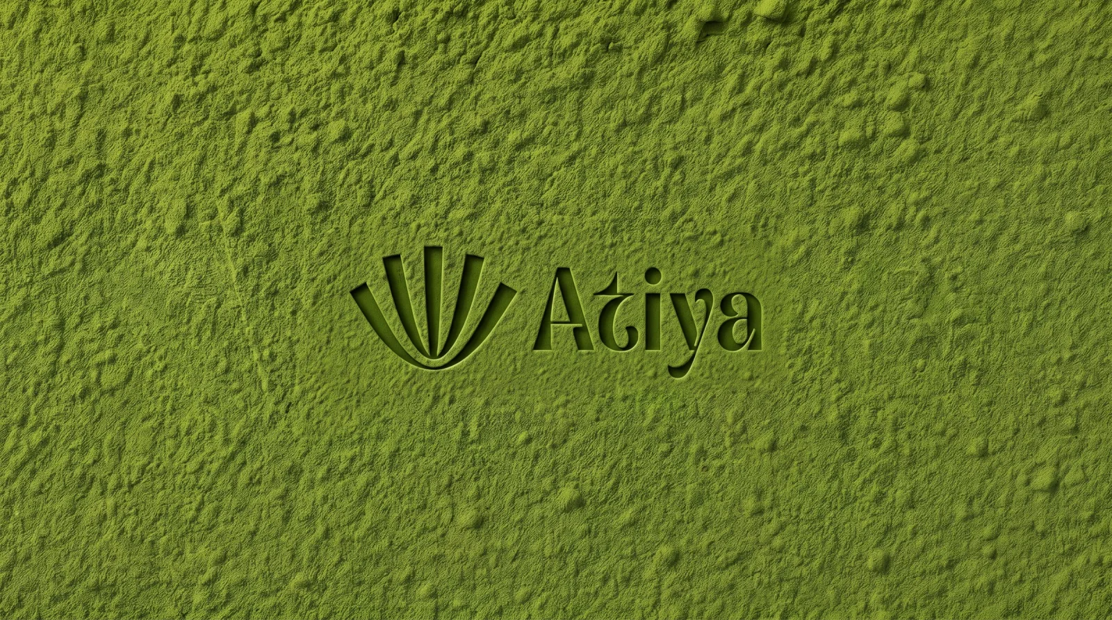
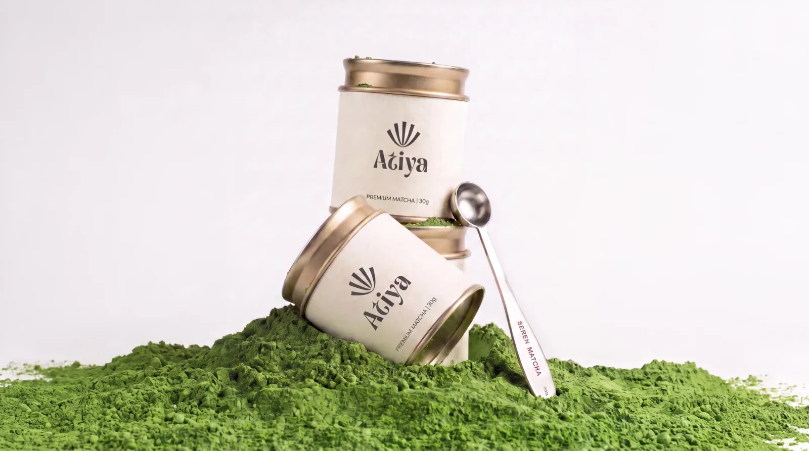
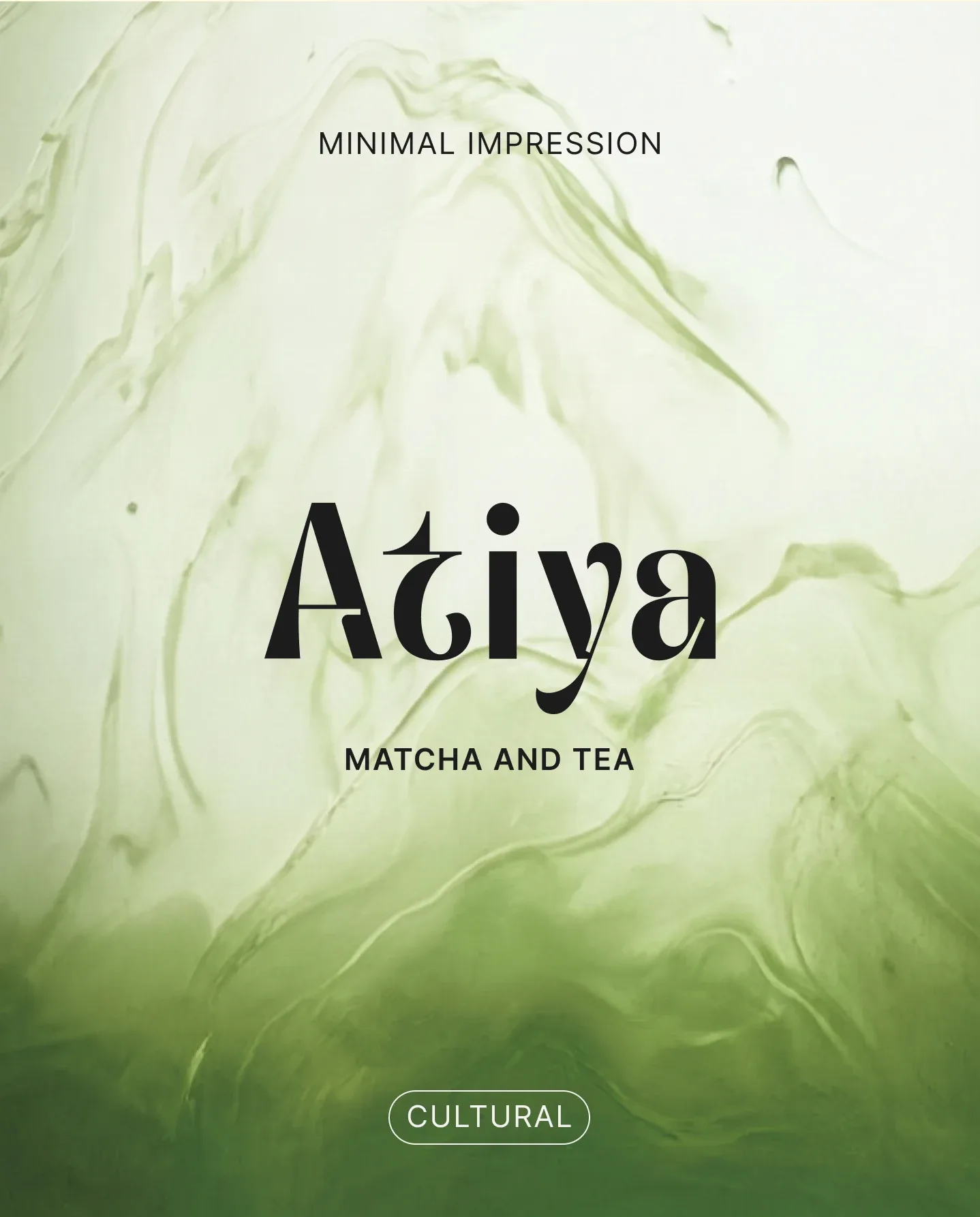
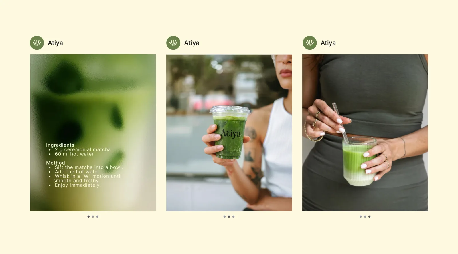
Brand identity for Atiya, a contemporary matcha-tea café: a symbol drawn from the bamboo chasen, the Avoraty display serif, a six-colour system from ceramic to woodland, tin packaging, cup and glassware, campaign photography and social.
ATIYA
Born from the bamboo whisk. The logo reflects it.
The brief
A ritual, not a beverage
Atiya is a contemporary matcha-tea café brand that reimagines the ritual of matcha through a refined and minimalist identity. Rooted in balance, craftsmanship, and intentional simplicity, the brand creates an experience where every detail, from the visual language to the packaging, reflects calm confidence and modern sophistication.
Hazel Green
800
700
600
Woodland
800
700
600
Mule Fawn
Scotch Mist
Ceramic
Rangoon Green
“The ground stone bright green, the essence that carries stillness into motion.”