Lyonne
Not made to stand out. Made to belong.
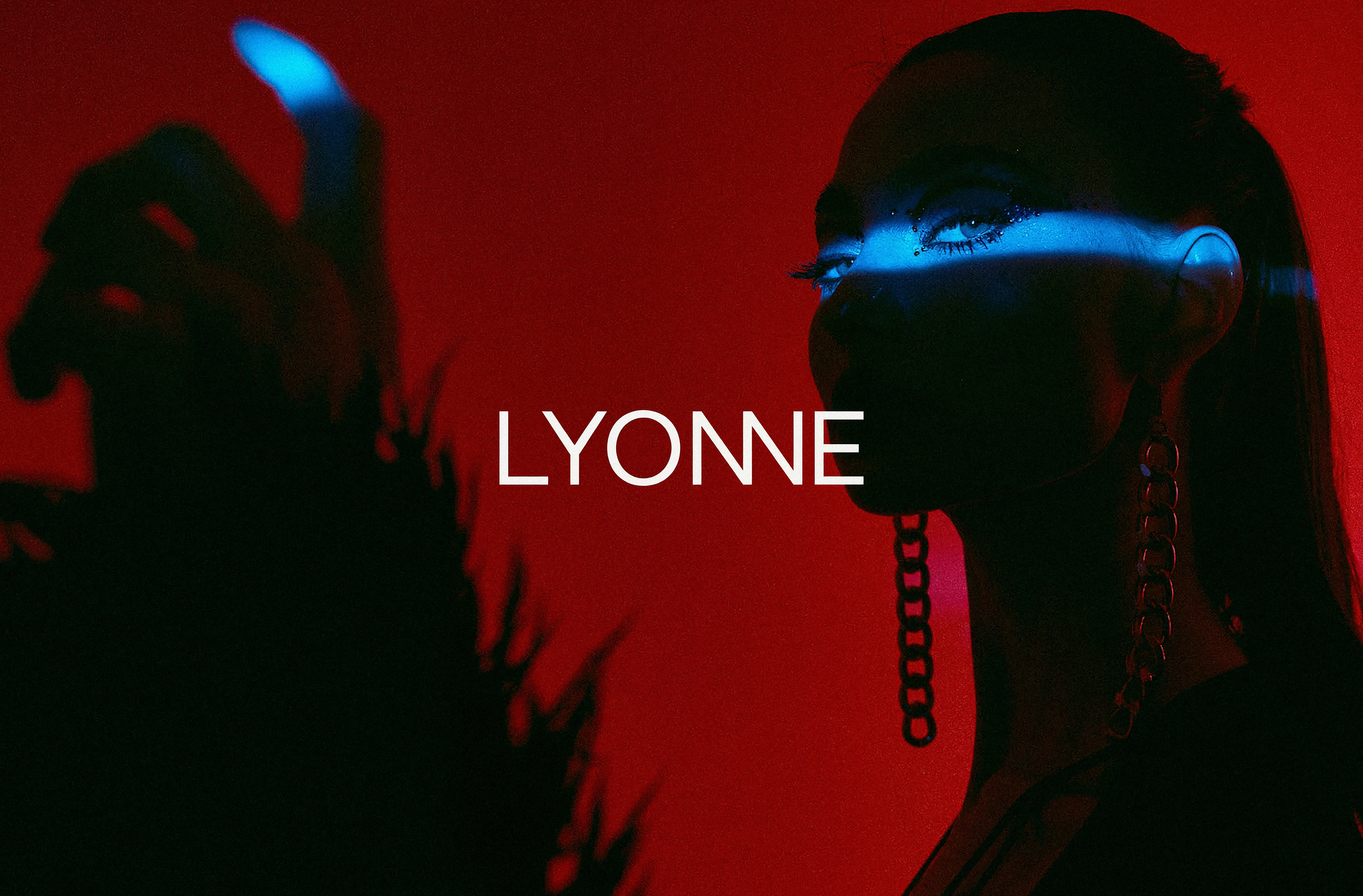
The tension
Composed until it isn’t
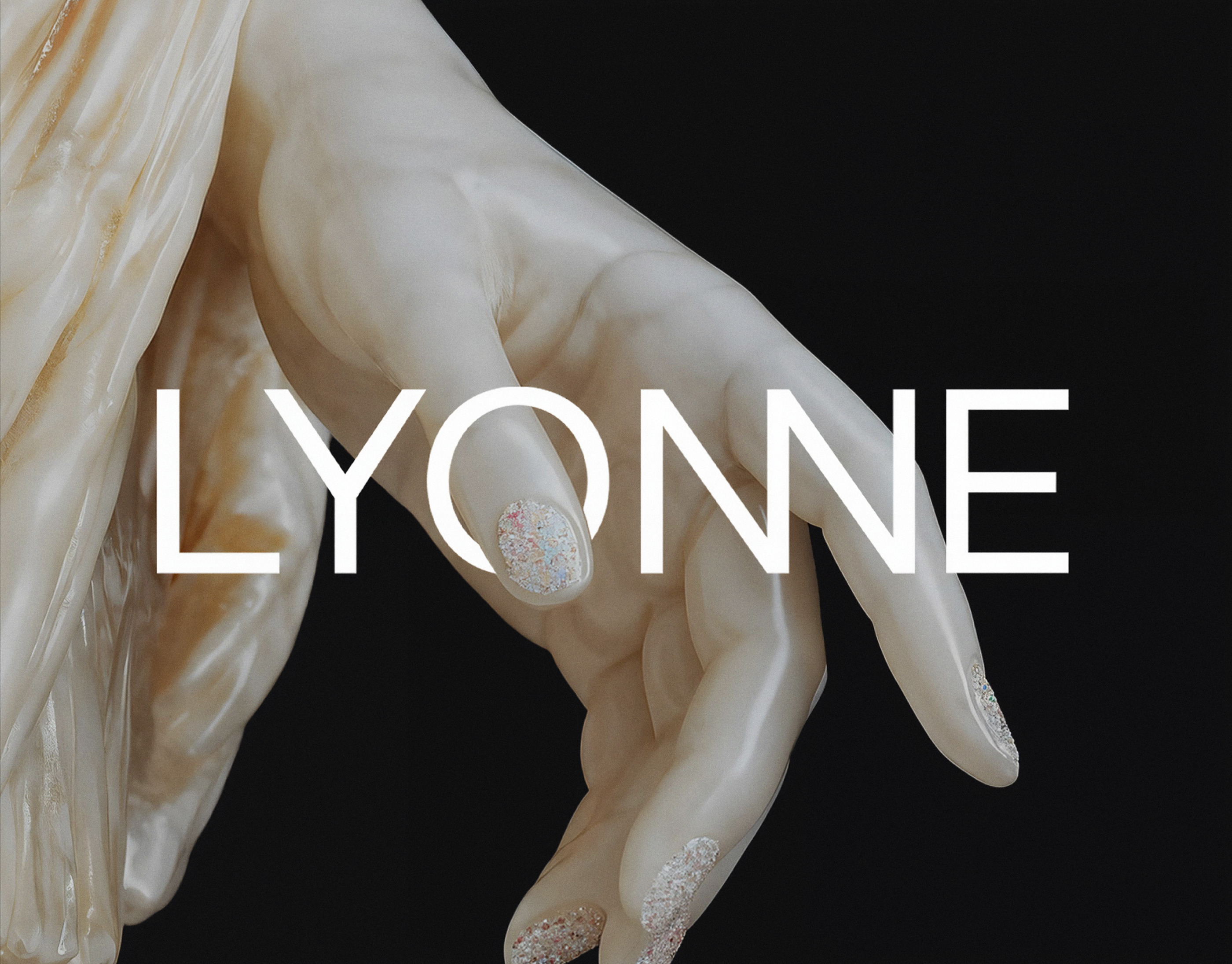
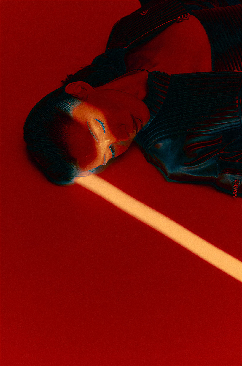
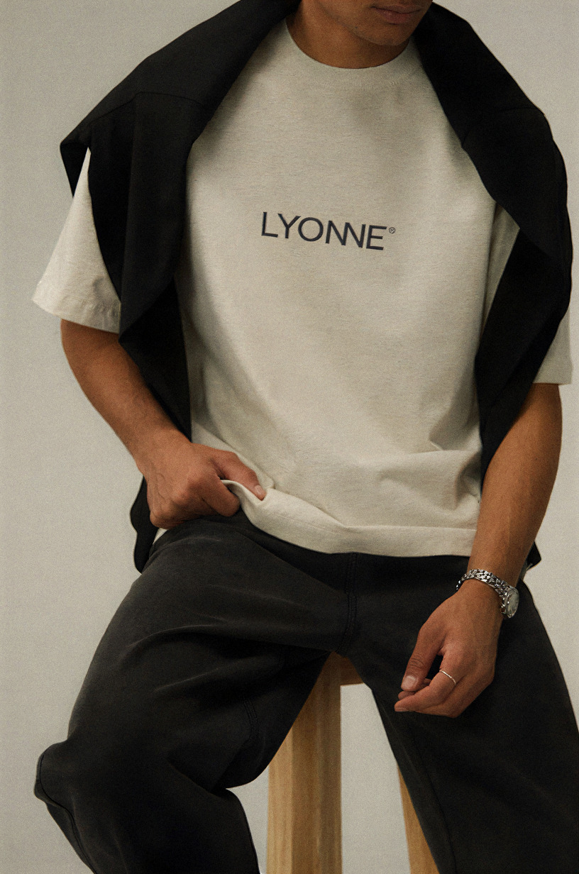
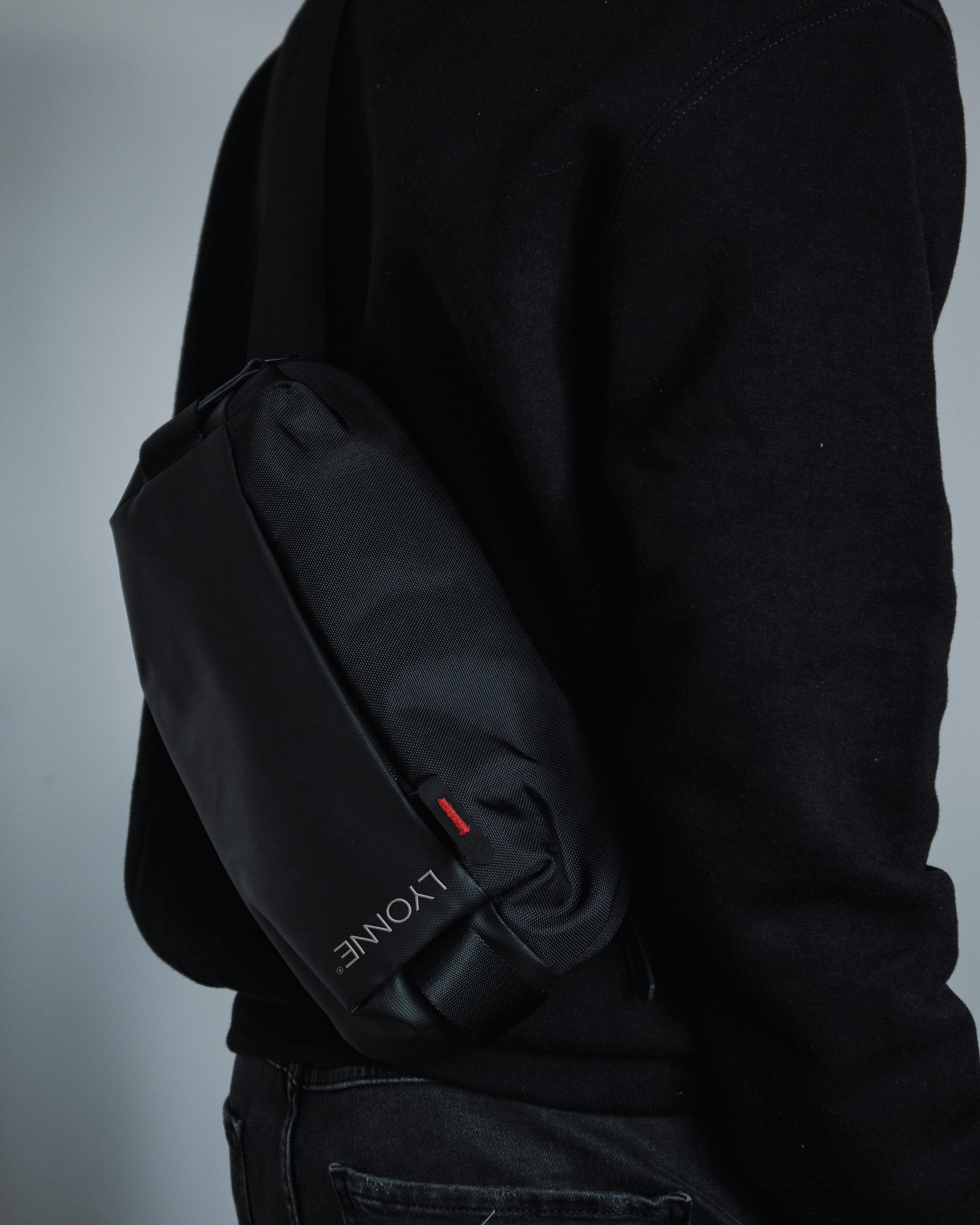
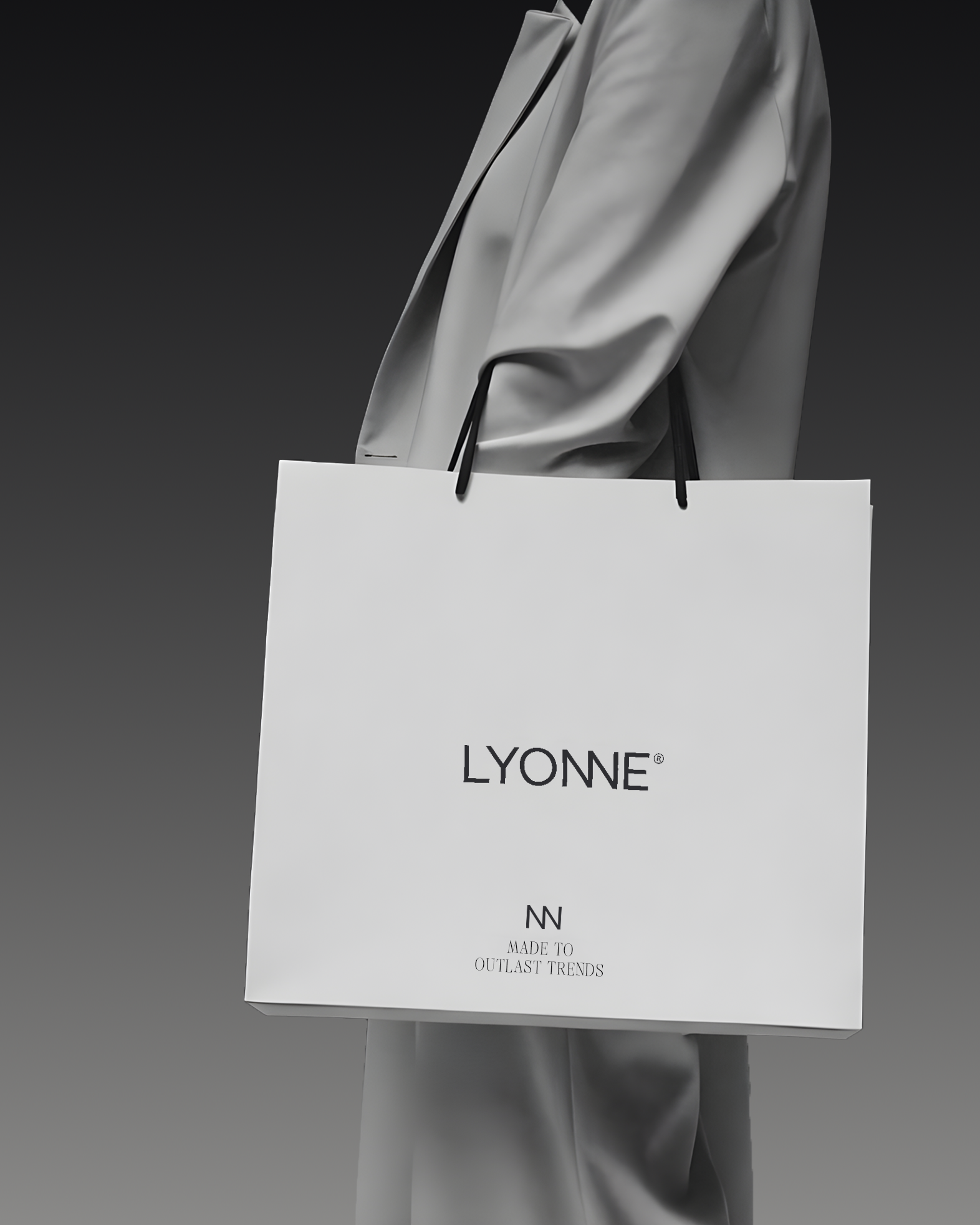
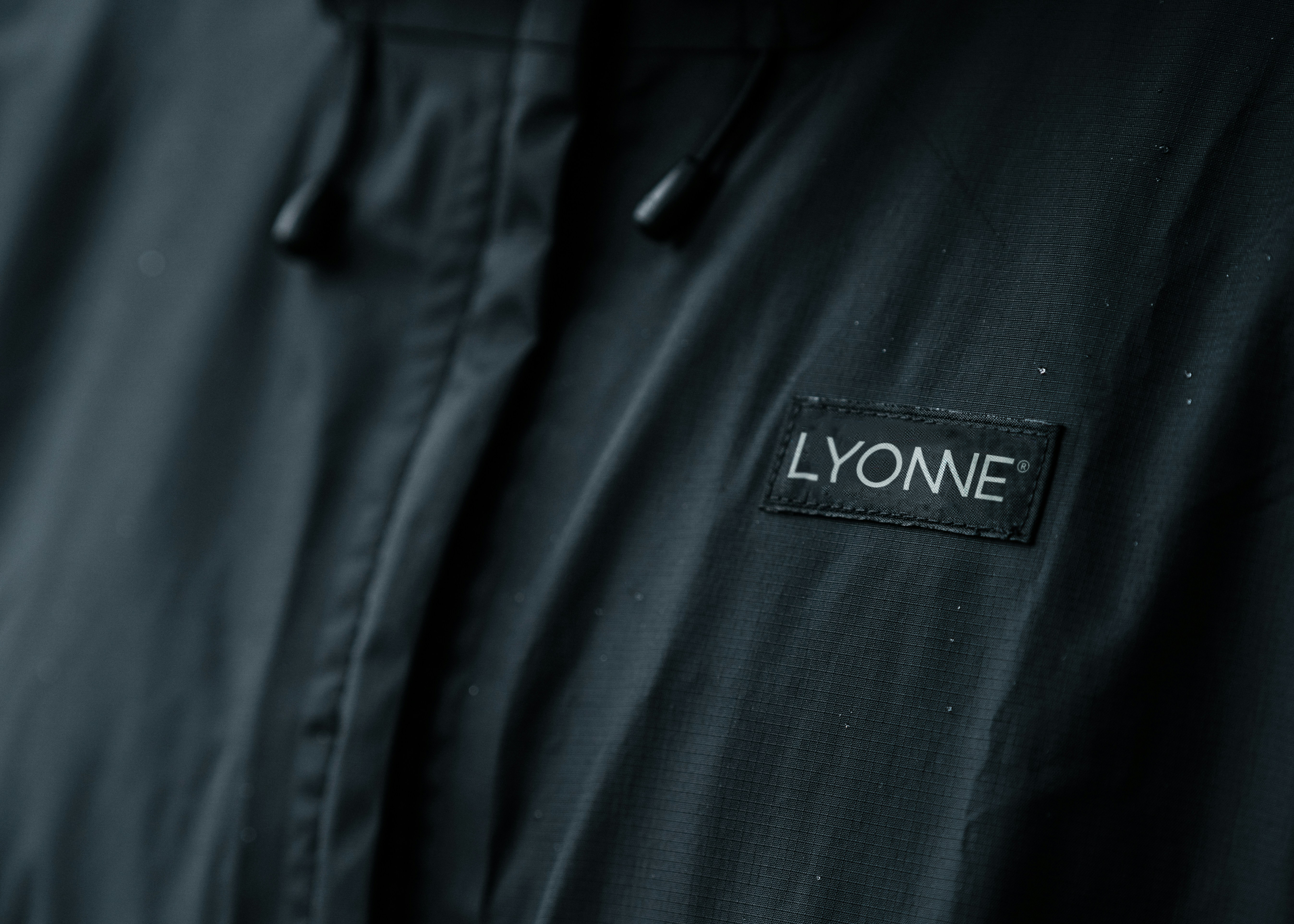
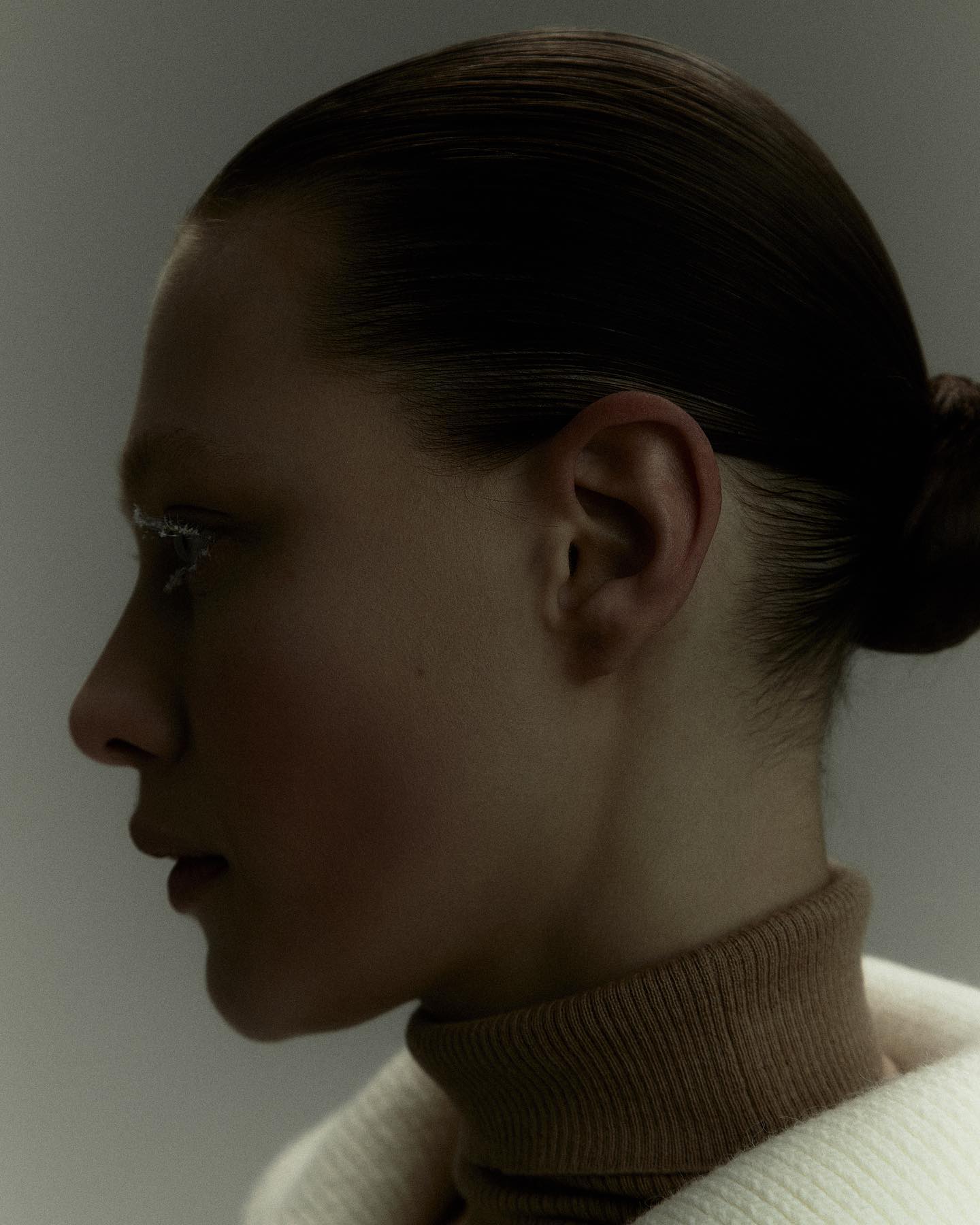
Lyonne is understated luxury built on restraint. A geometric wordmark whose two N letterforms merge into one diagonal, oxblood Rosewood on folders, cards and prints, hairline serif taglines. Then the photography deliberately loosens: red gel, a light bar across the eyes, motion blur, a sculpted marble hand with crystal nails. That tension between a calm system and charged imagery is the brand.
The construction
One diagonal, shared
The campaign, numbered
01 — 04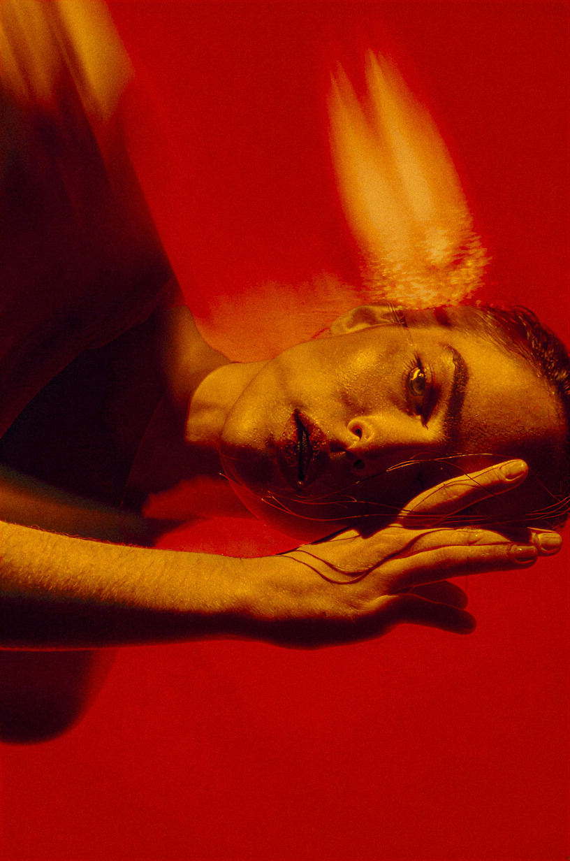
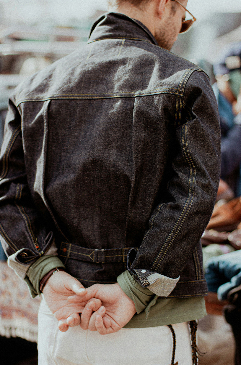
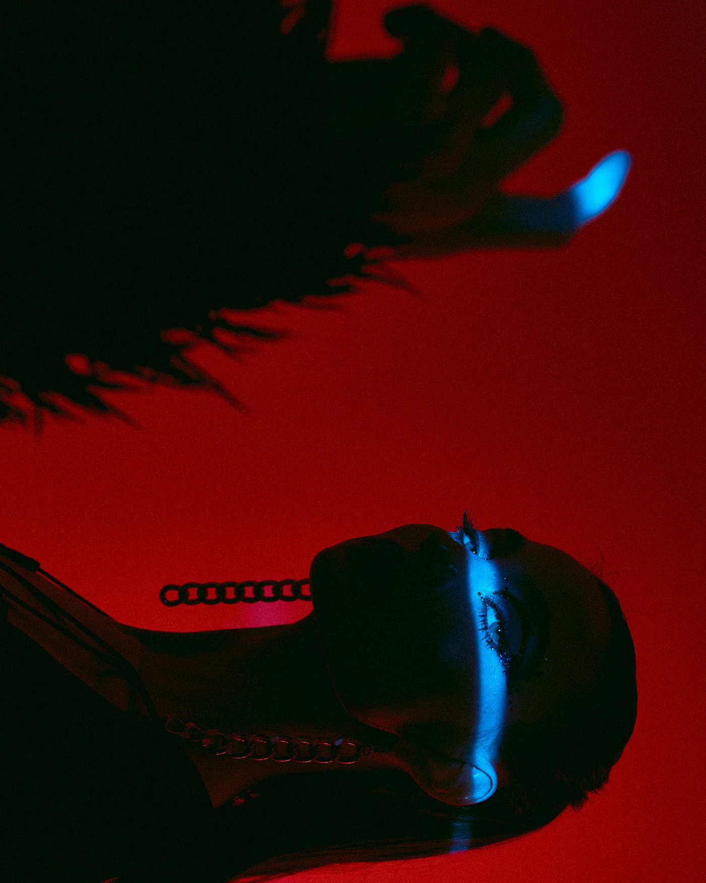
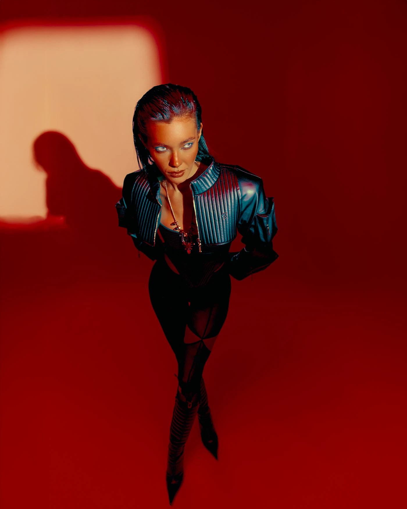
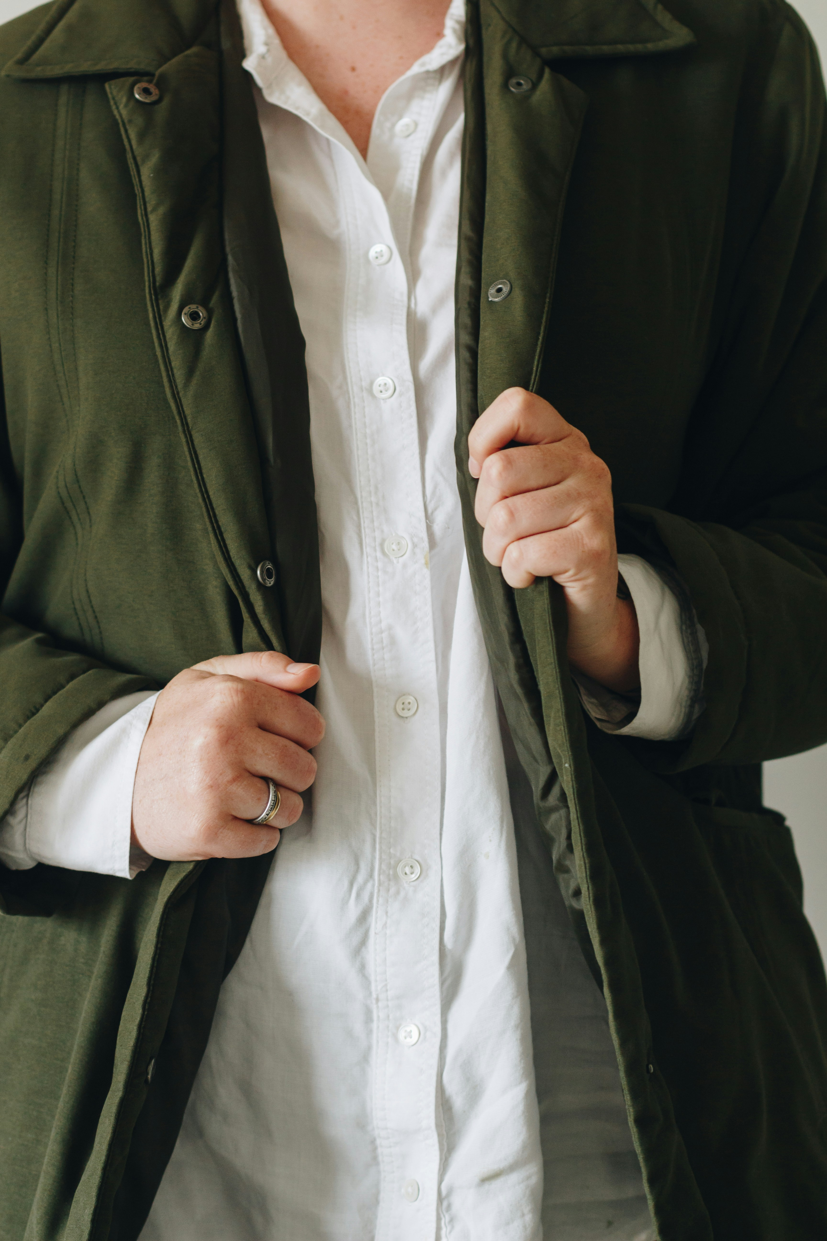
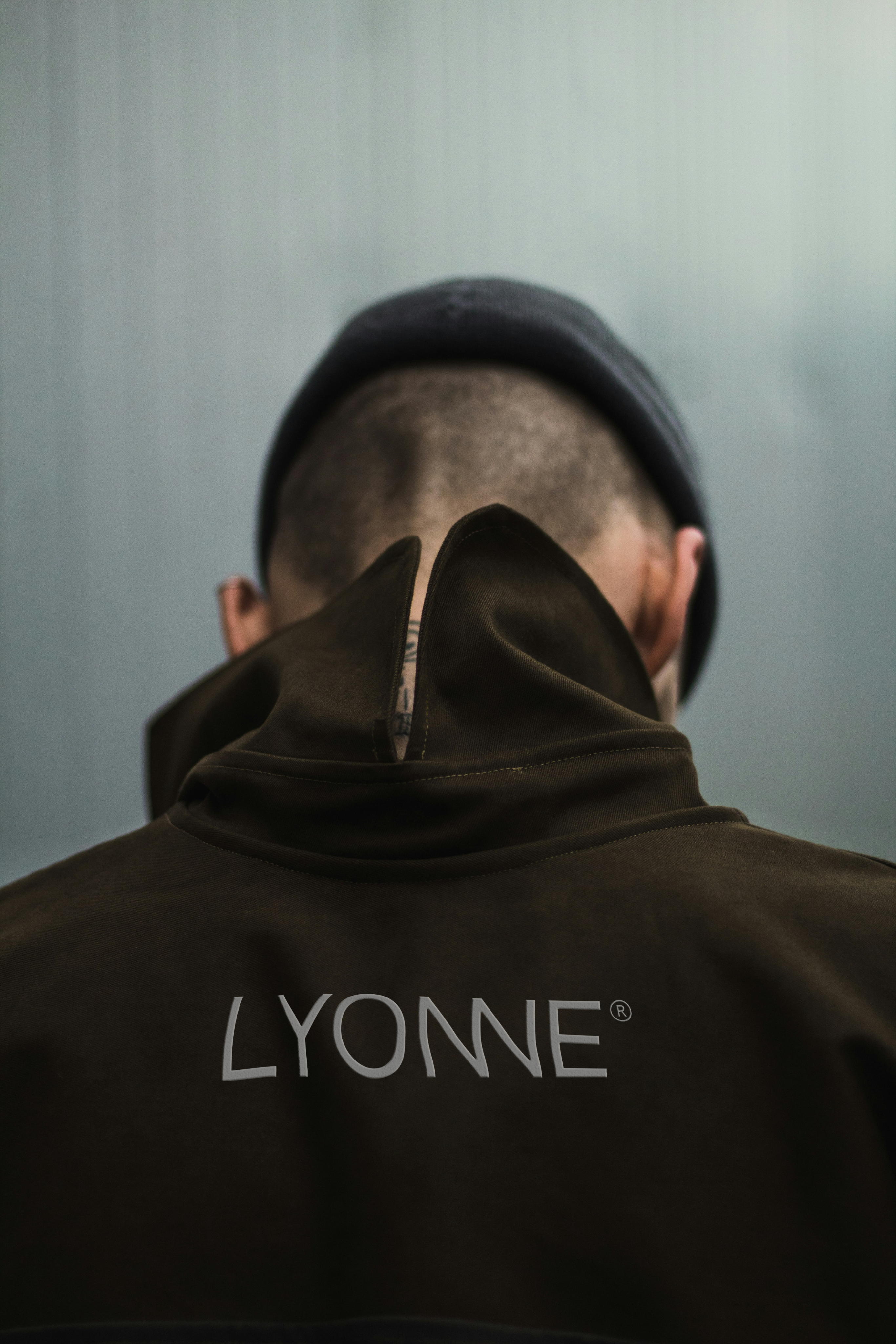
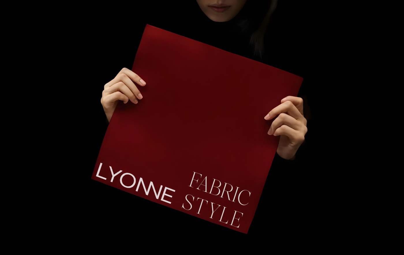
We sketch, erase, rework, until a piece finally feels balanced.
From the Lyonne manifesto
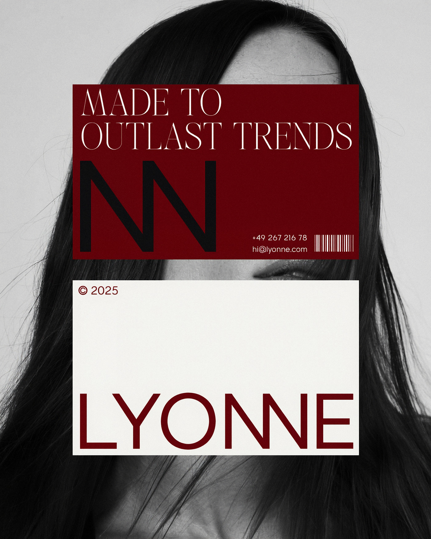
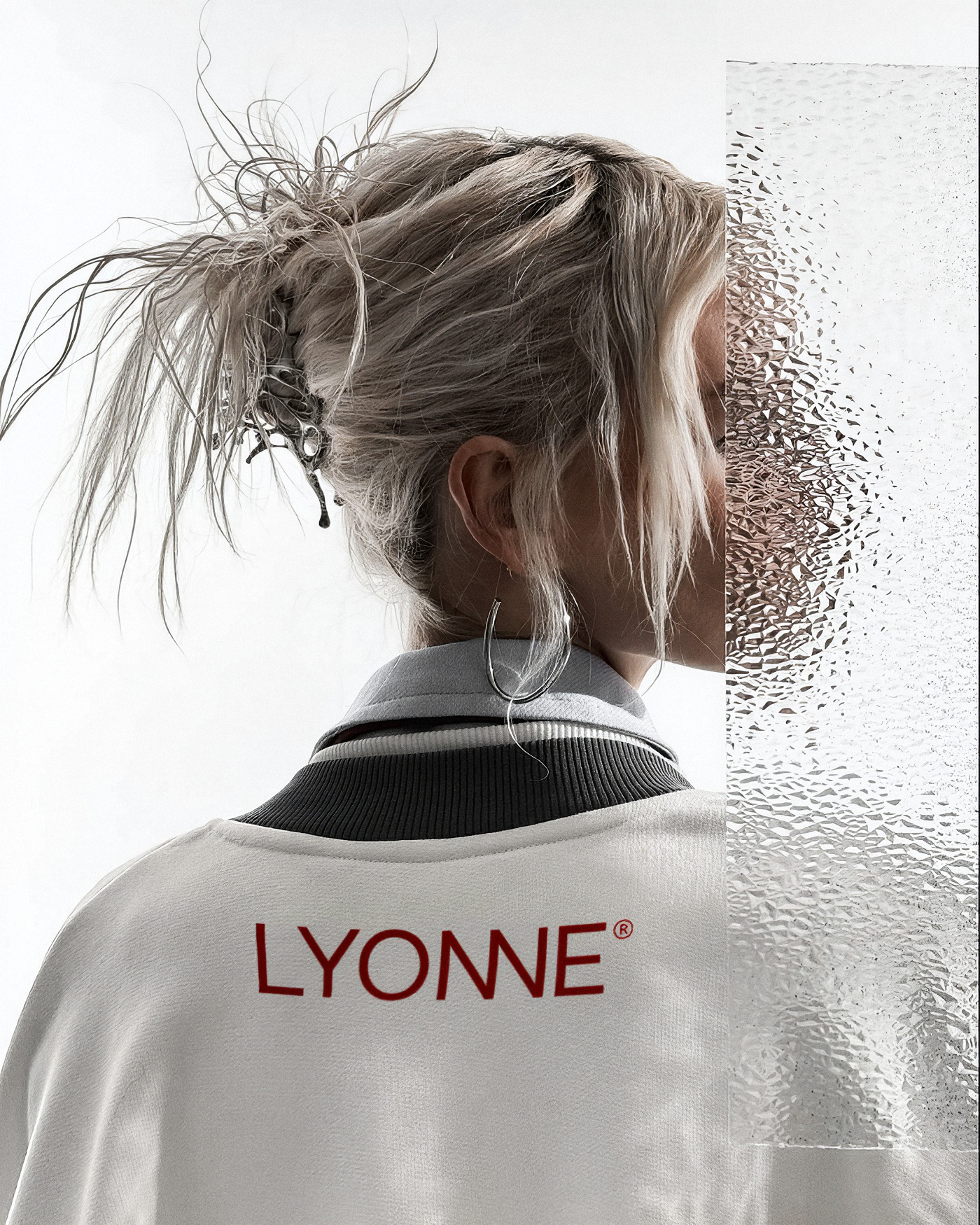
Made To Outlast Trends
One that celebrates individuality, restraint, and the power of subtle expression.
Every Form
Evokes Emotion
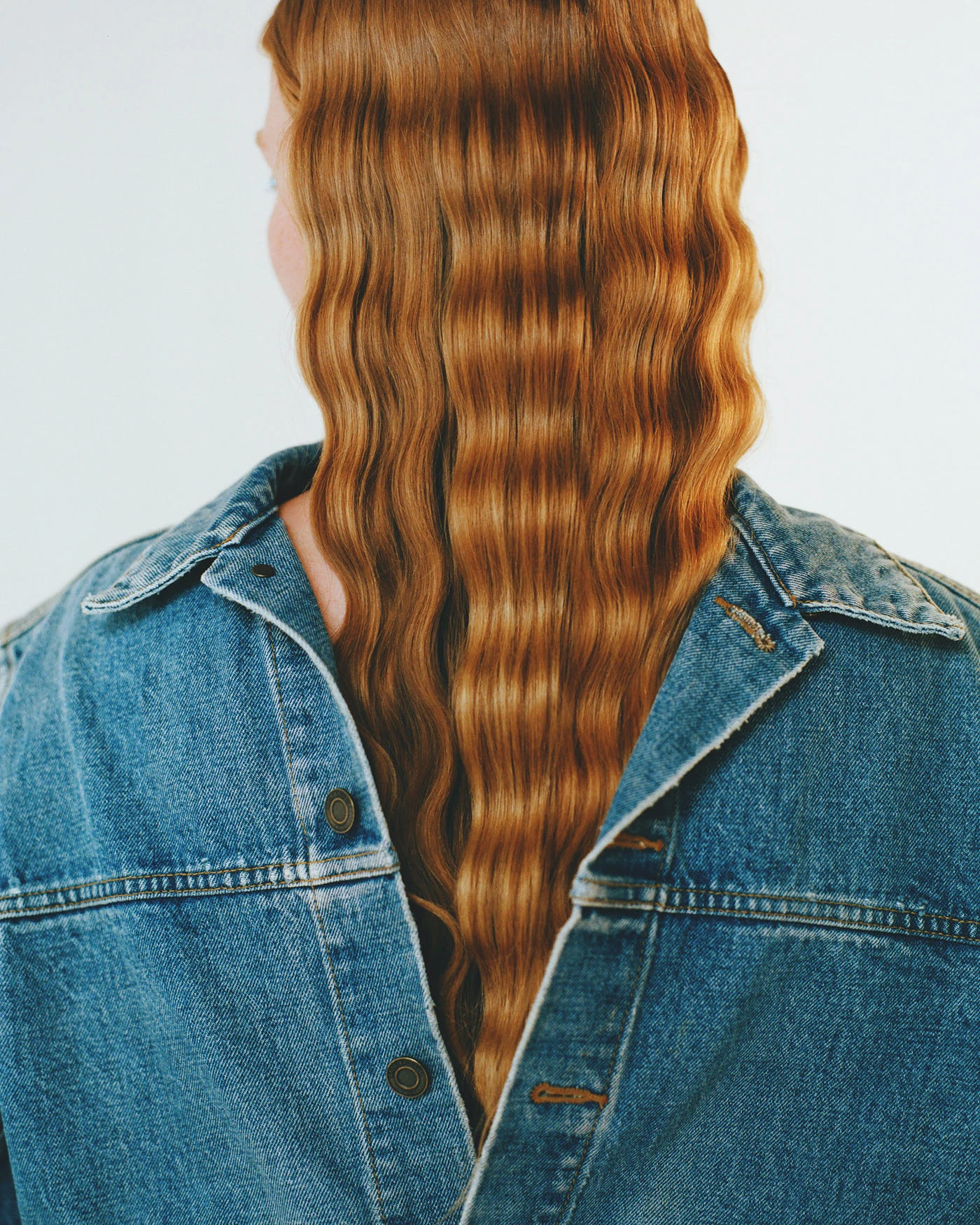 Made to outlast trends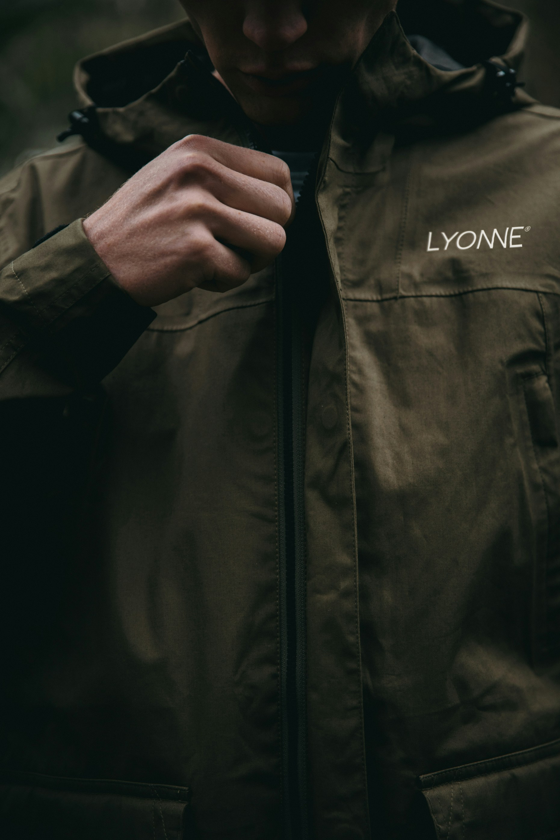
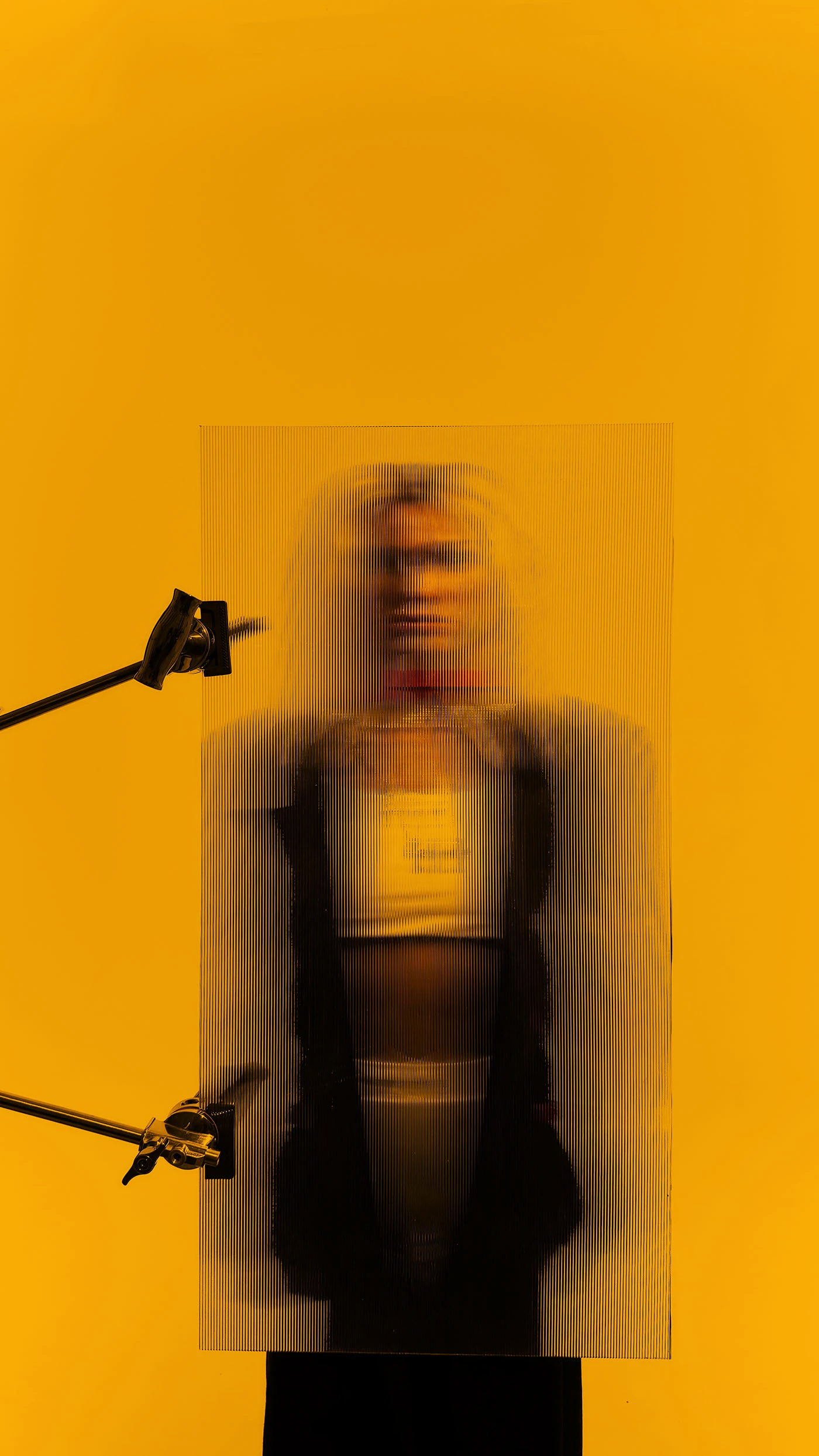
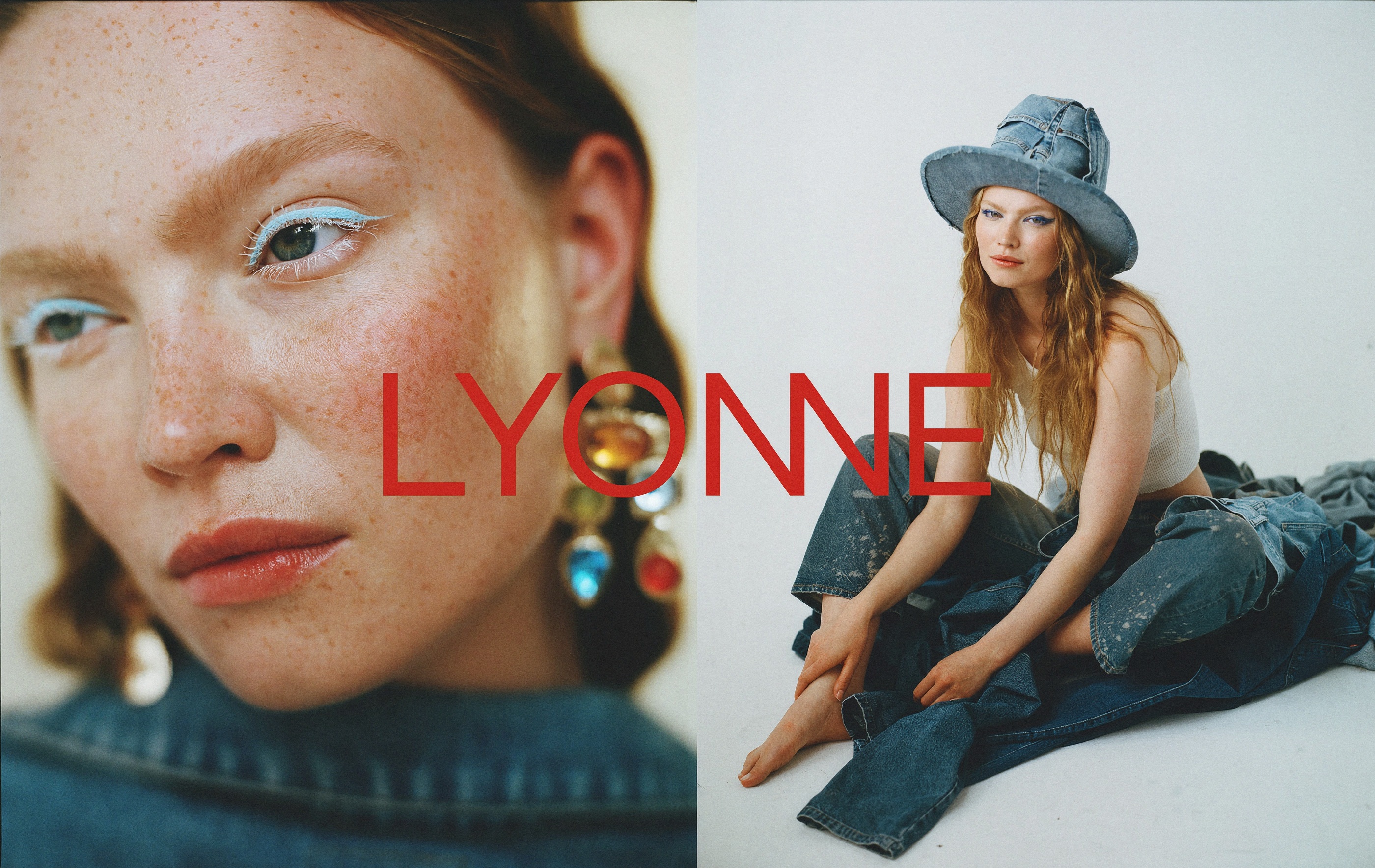
Made To Outlast Trends
هوية بصرية لليون، علامة أزياء: شعار كتابي بحرفَي N مدمجين وحرف مركّب، ونظام لوني بين خشب الورد والعقيق الأسود مع عبارات بخط سيريف رفيع، وتصوير إعلاني مشحون، ومطبوعات على الملابس، وقرطاسية، وتغليف، وكتيّب أعمال مرقّم.
اقرأ دراسة الحالة كاملة ↗