Lyonne
Quiet luxury with a subversive streak, made to outlast trends
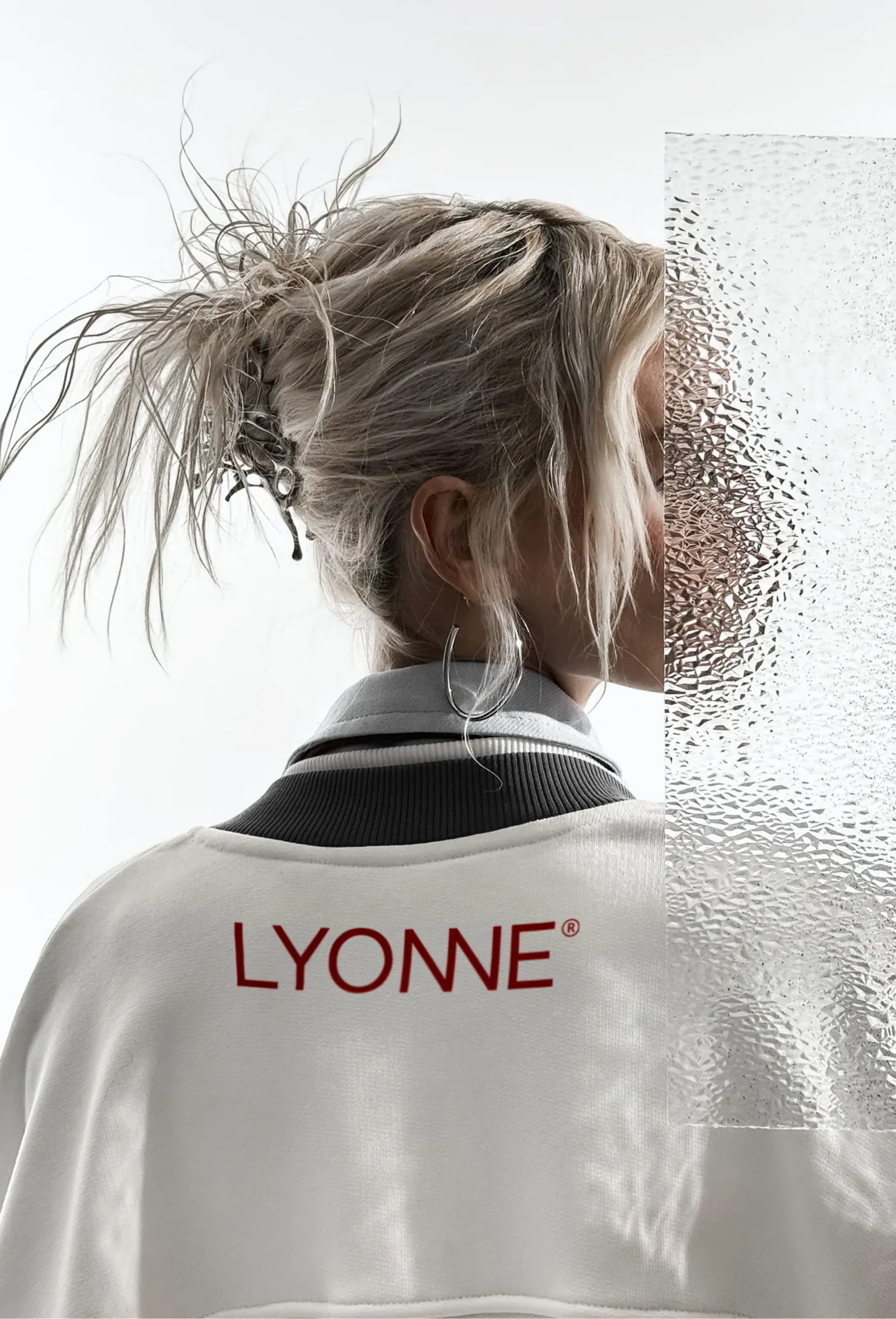
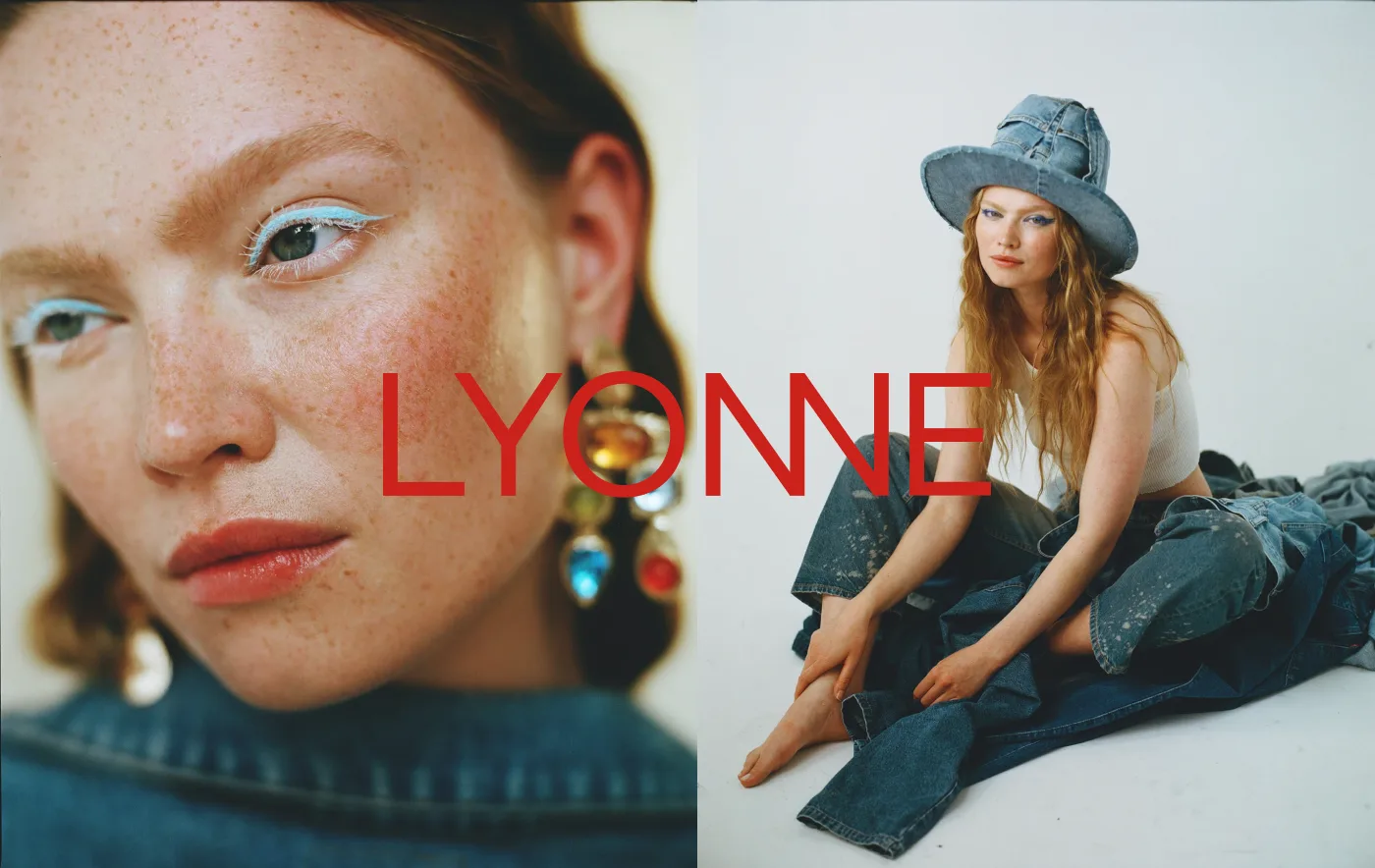
Brand identity for Lyonne, a fashion label: the merged NN wordmark and monogram, a Rosewood and Onyx system with hairline serif taglines, charged campaign photography, apparel prints, stationery, packaging and a numbered lookbook.
Not made to stand out. Made to belong.
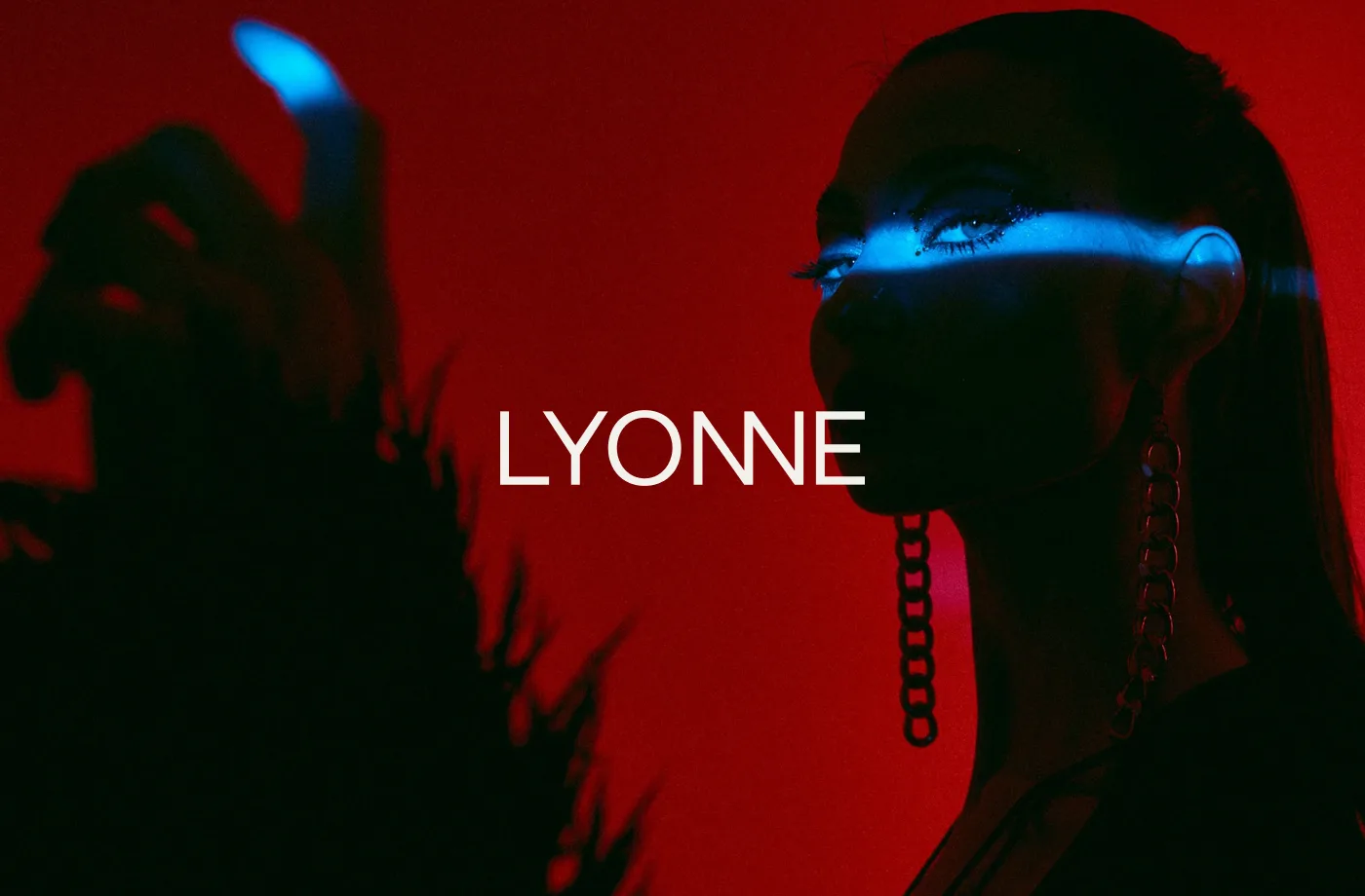
The tension
Composed until it isn't
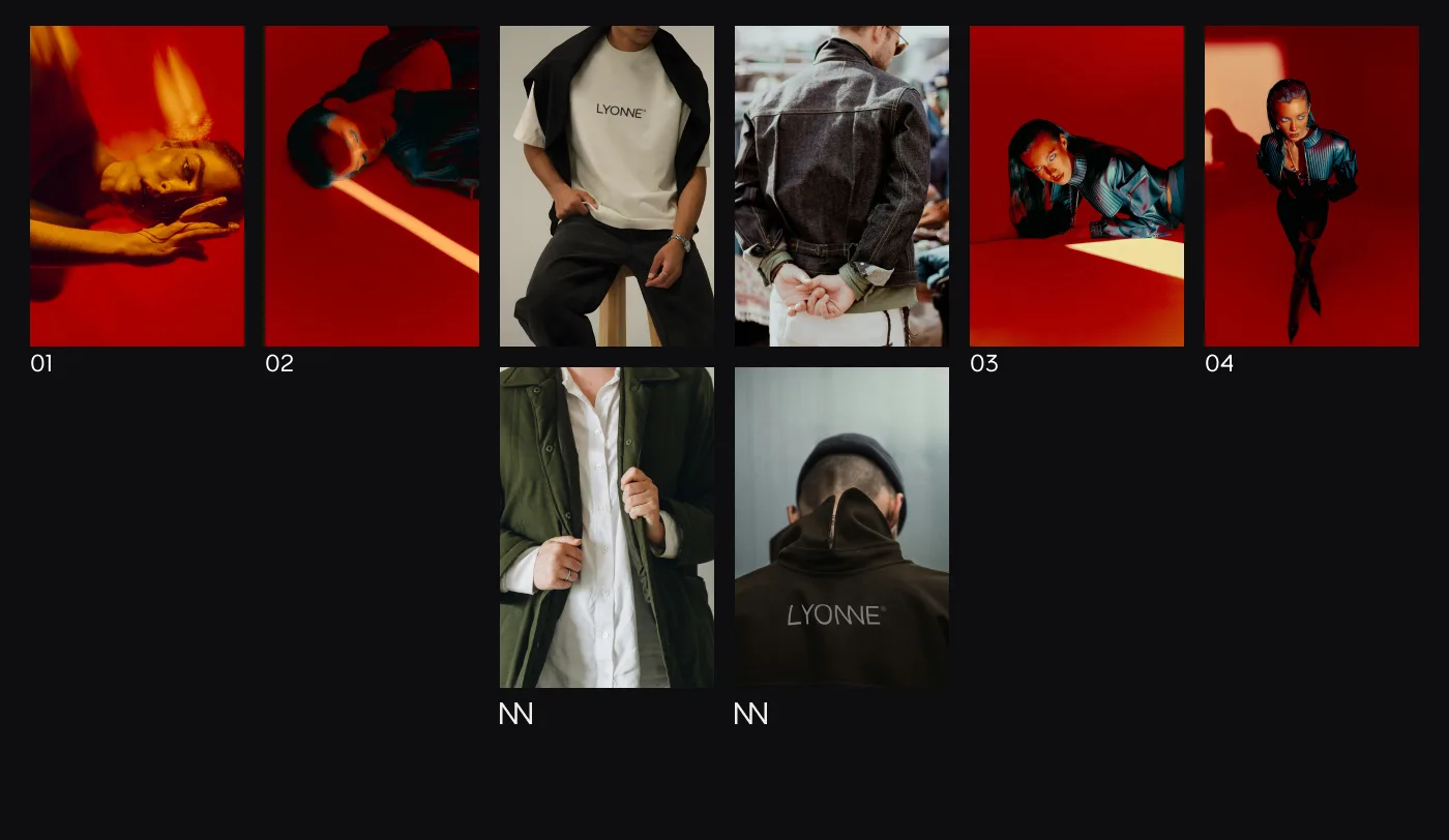
Lyonne is understated luxury built on restraint. A geometric wordmark whose two N letterforms merge into one diagonal, oxblood Rosewood on folders, cards and prints, hairline serif taglines. Then the photography deliberately loosens: red gel, a light bar across the eyes, motion blur, a sculpted marble hand with crystal nails. That tension between a calm system and charged imagery is the brand.
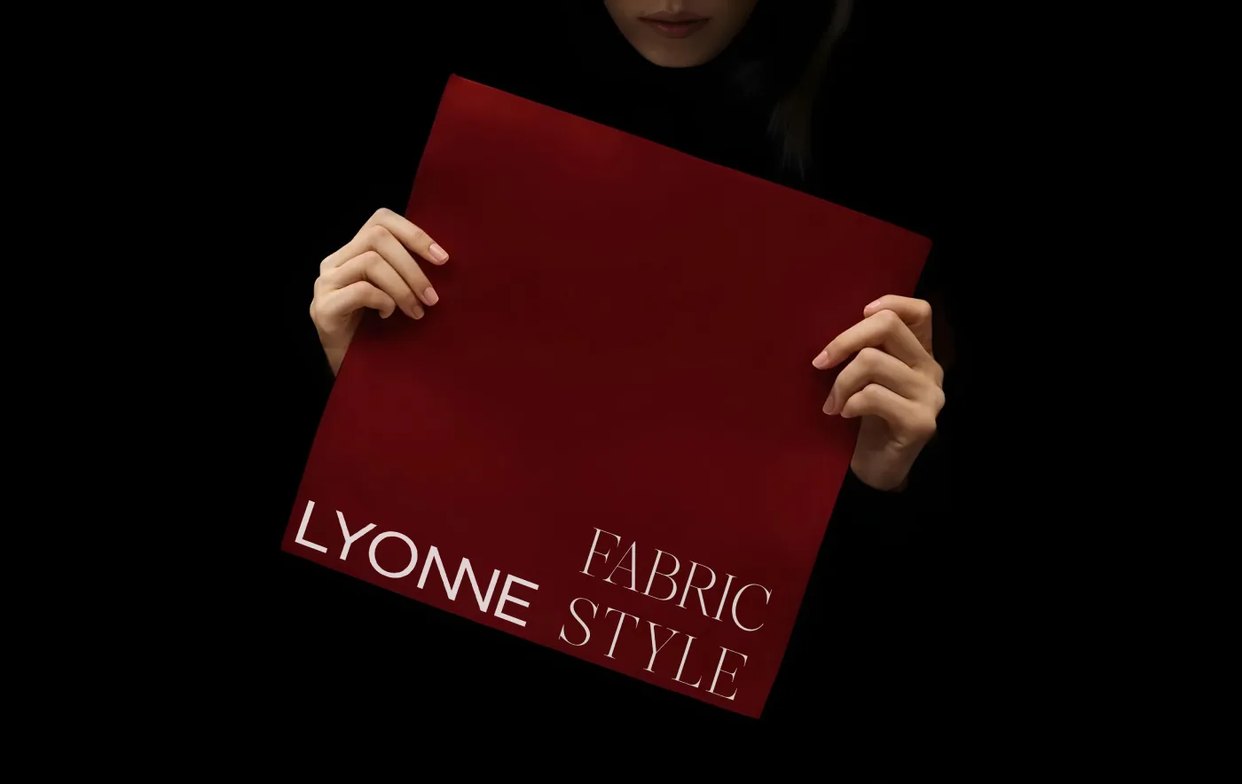
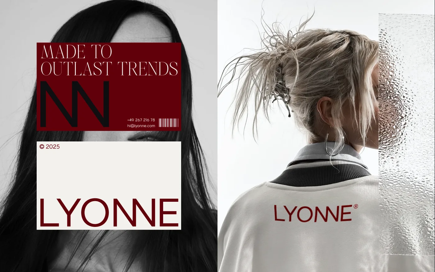
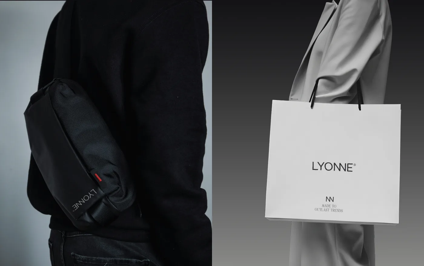
“We sketch, erase, rework, until a piece finally feels balanced.”
The campaign, numbered
The lookbook files the charged side of the brand like an archive, red gel editorials numbered 01 to 04 between quiet garment details. The system keeps its composure while the imagery runs hot, which is exactly the balance the label sells.