CRUST
Café Bakery. Slow Made. Well Loved.
Full brand identity for a neighborhood café bakery: strategy, packaging, environmental design, and a warm digital presence.
A neighborhood café bakery that needed a brand as warm as its morning coffee and as honest as its bread.
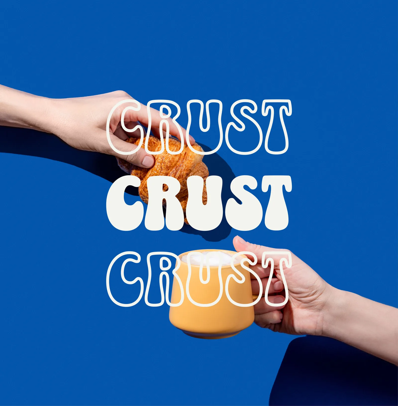
The Challenge
Great coffee. Great bread. No brand to match.
CRUST already had the essentials: a loyal morning crowd, killer pastries, and a pour-over that kept people coming back. What was missing was a brand that felt as intentional as their menu. They needed an identity that could carry from the chalkboard to the coffee sleeve to the storefront.
Brand workshops
Concept directions
Design variations
Perfect outcome
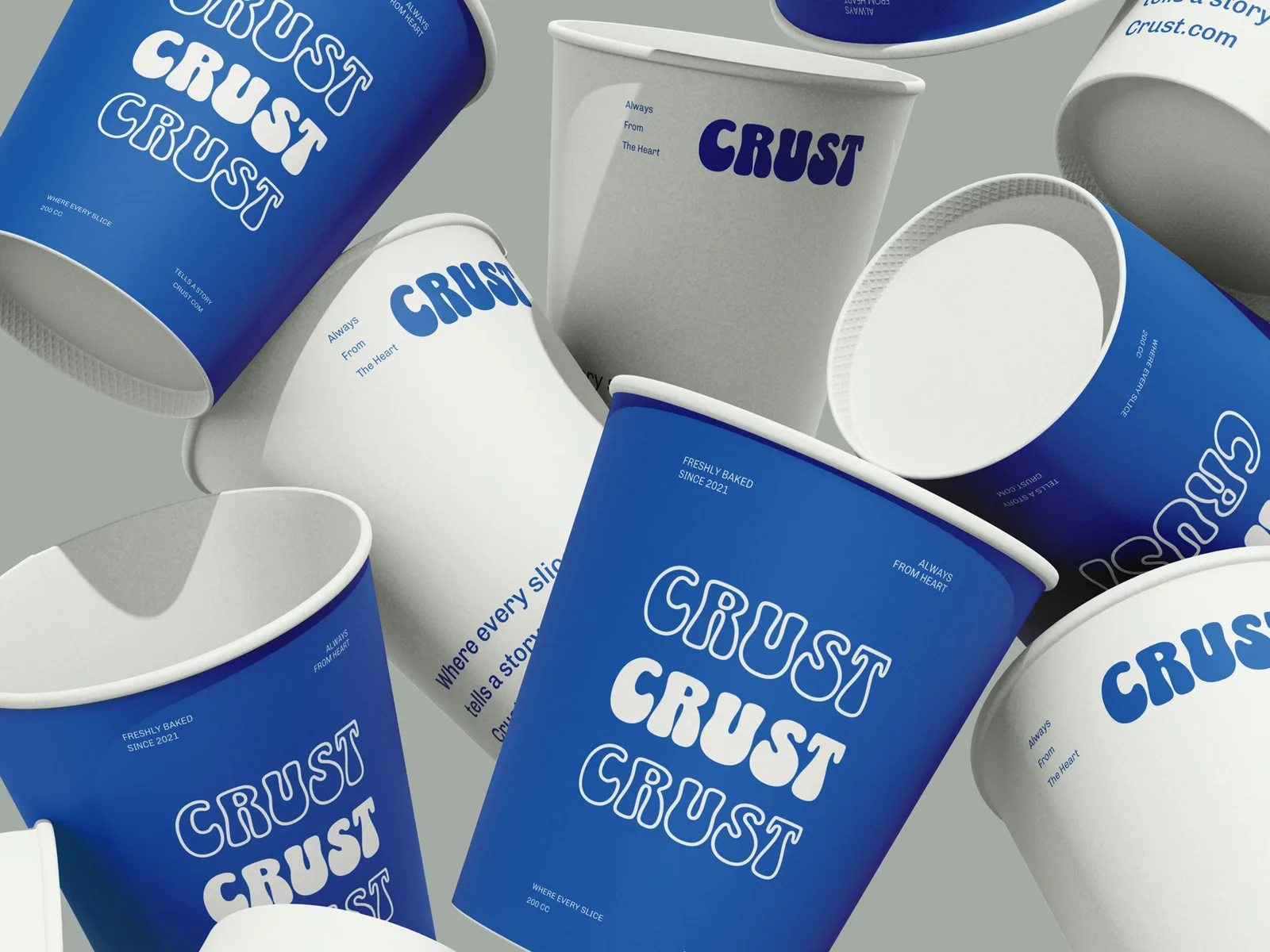
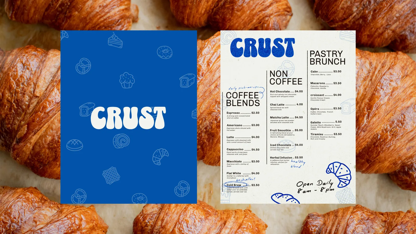
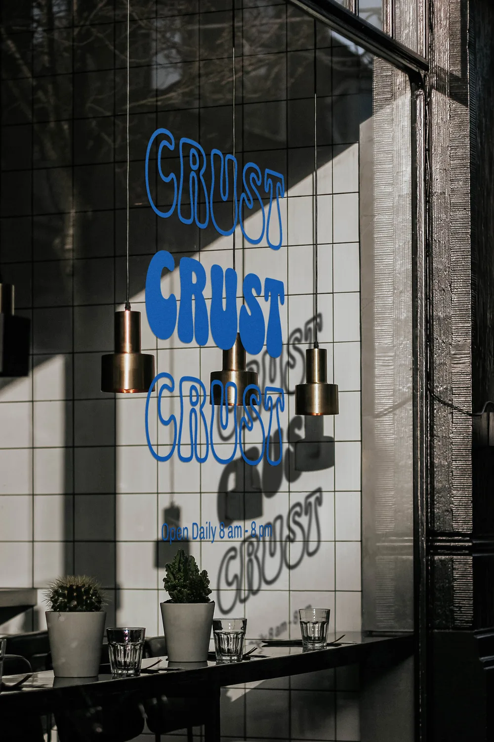
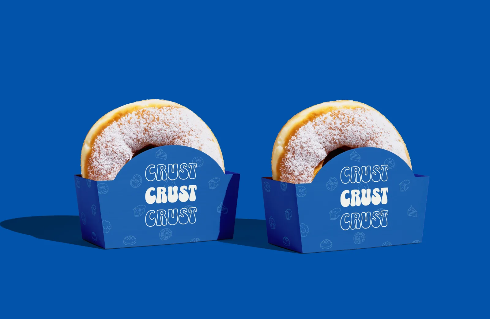
Packaging
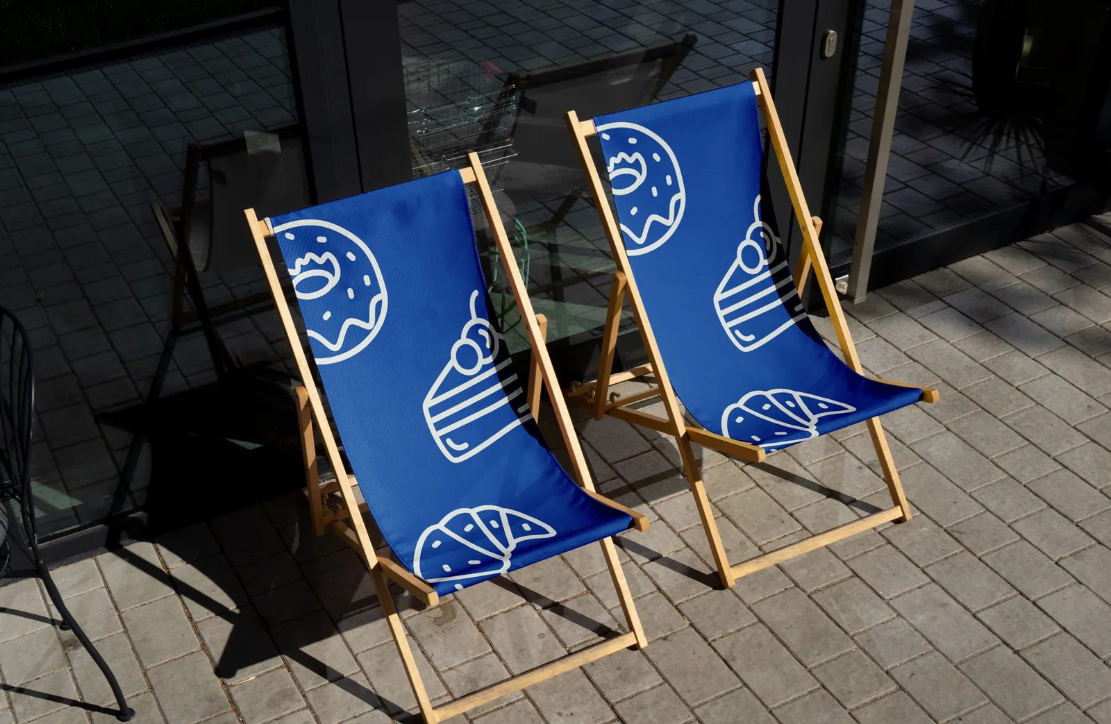
Grab a seat. Grab a coffee. Stay a while.
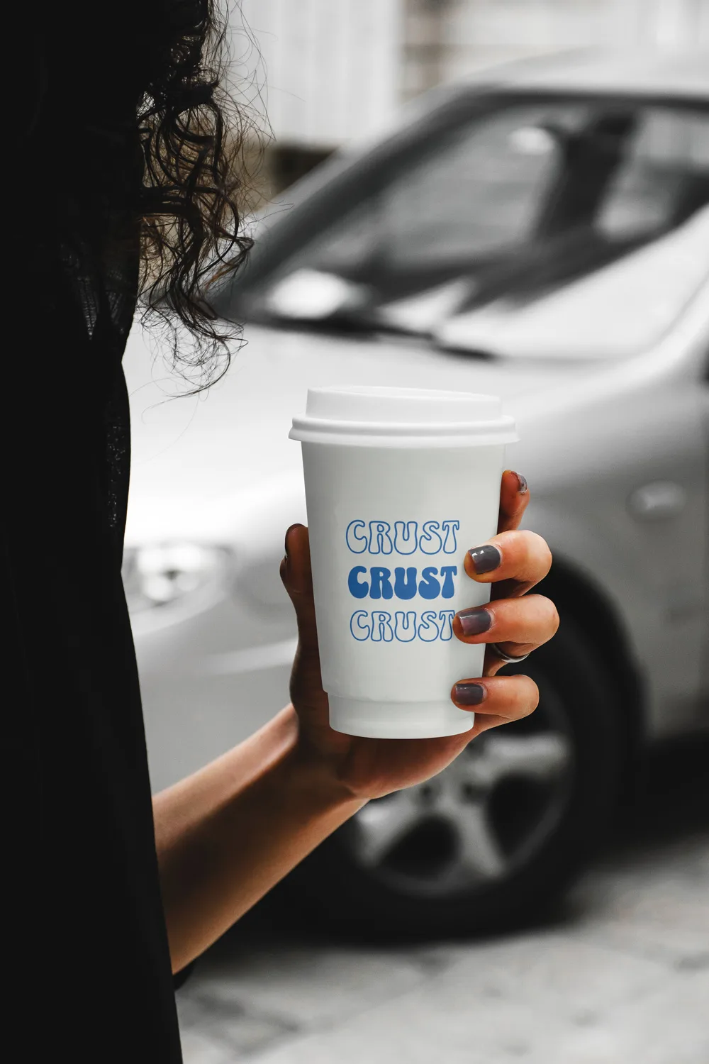
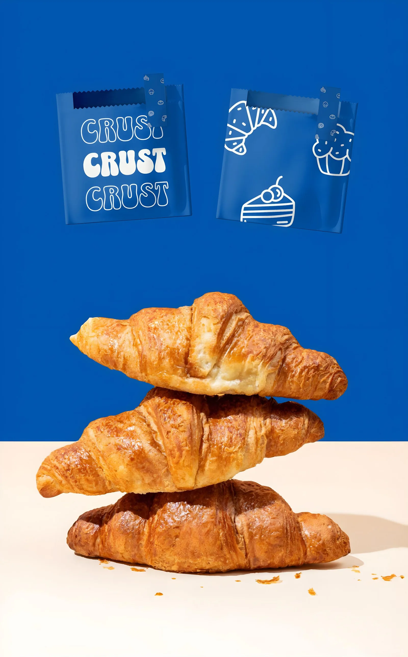
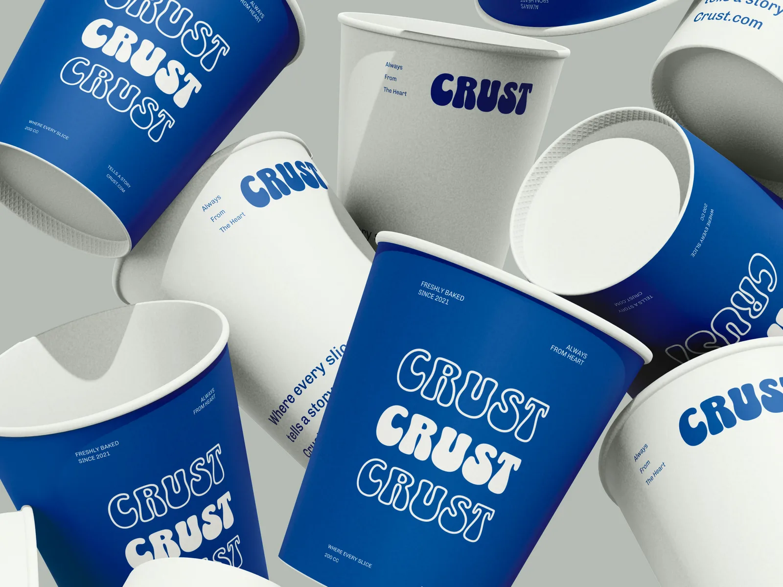
From the cup you carry out to the bag your pastry comes in, every touchpoint is a chance to say "this café cares." Earthy textures and the confident CRUST mark make the whole experience feel connected, whether you're at a table or on the go.