Local Shell
Let's find your favorite sauce
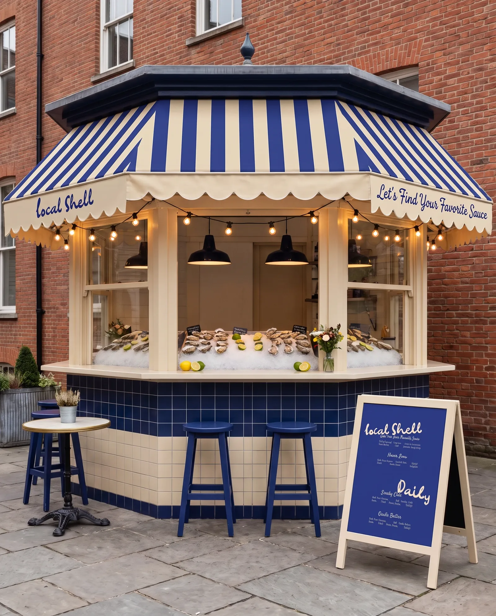
Brand identity for Local Shell, an oyster bar and raw-bar stall: a mark inked by hand in fifty-three strokes, three colours used four ways round, a menu built on one question, and a system that runs from the awning to the sauce pots.
Let's find your favorite sauce.
The brief
One question, asked on the awning
Local Shell is a raw bar with no shopfront to design: a strip of awning, a tiled counter and a board on the pavement. The identity is built around the one question the brand asks before you reach the counter, and the answer is three sauces. So there are three colours and the mark is drawn in each of them on each of the others, the menu is the question with three answers under it, and every surface commits to one pairing rather than mixing them.
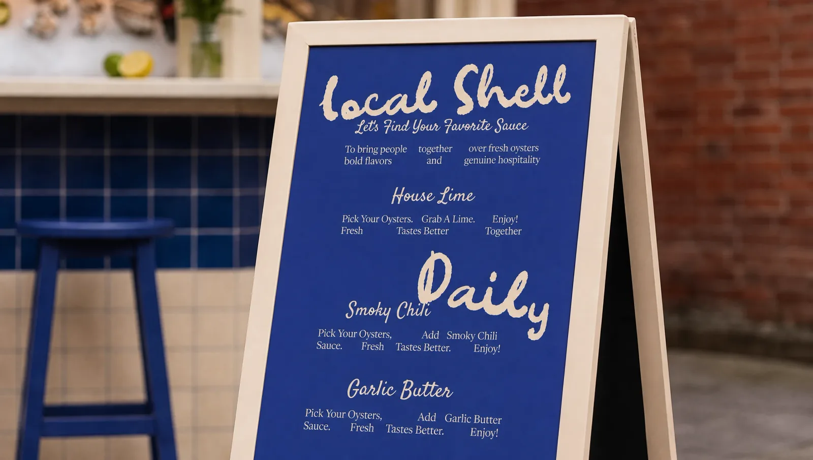
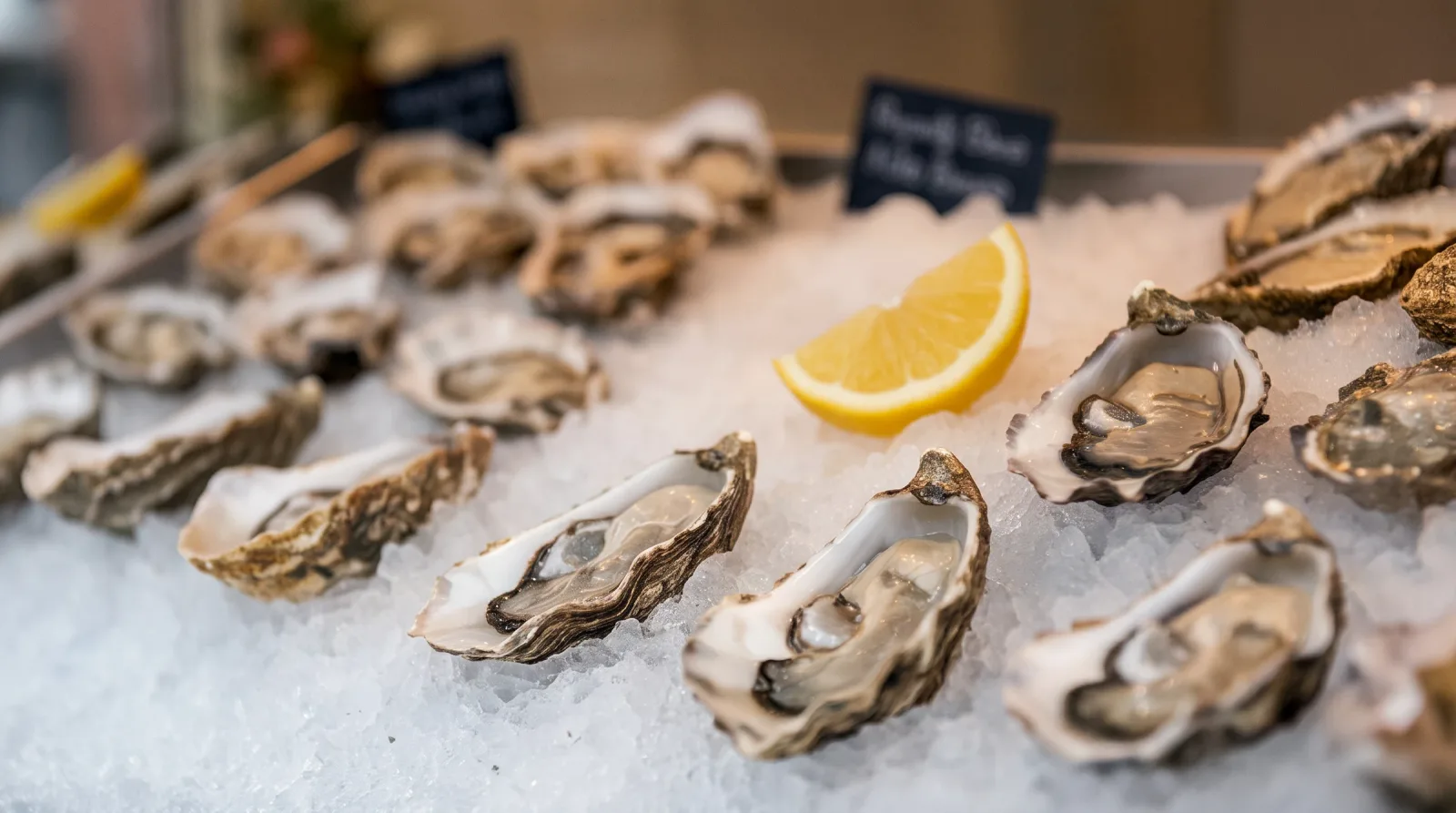
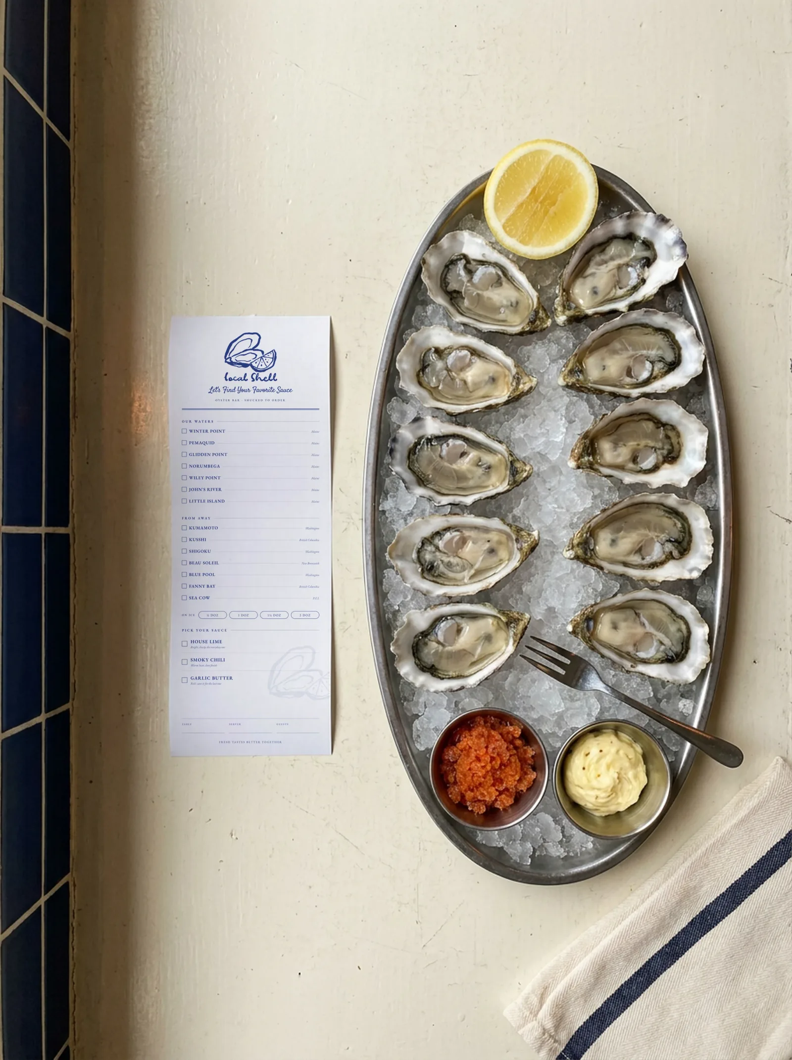
“Fresh tastes better together.”
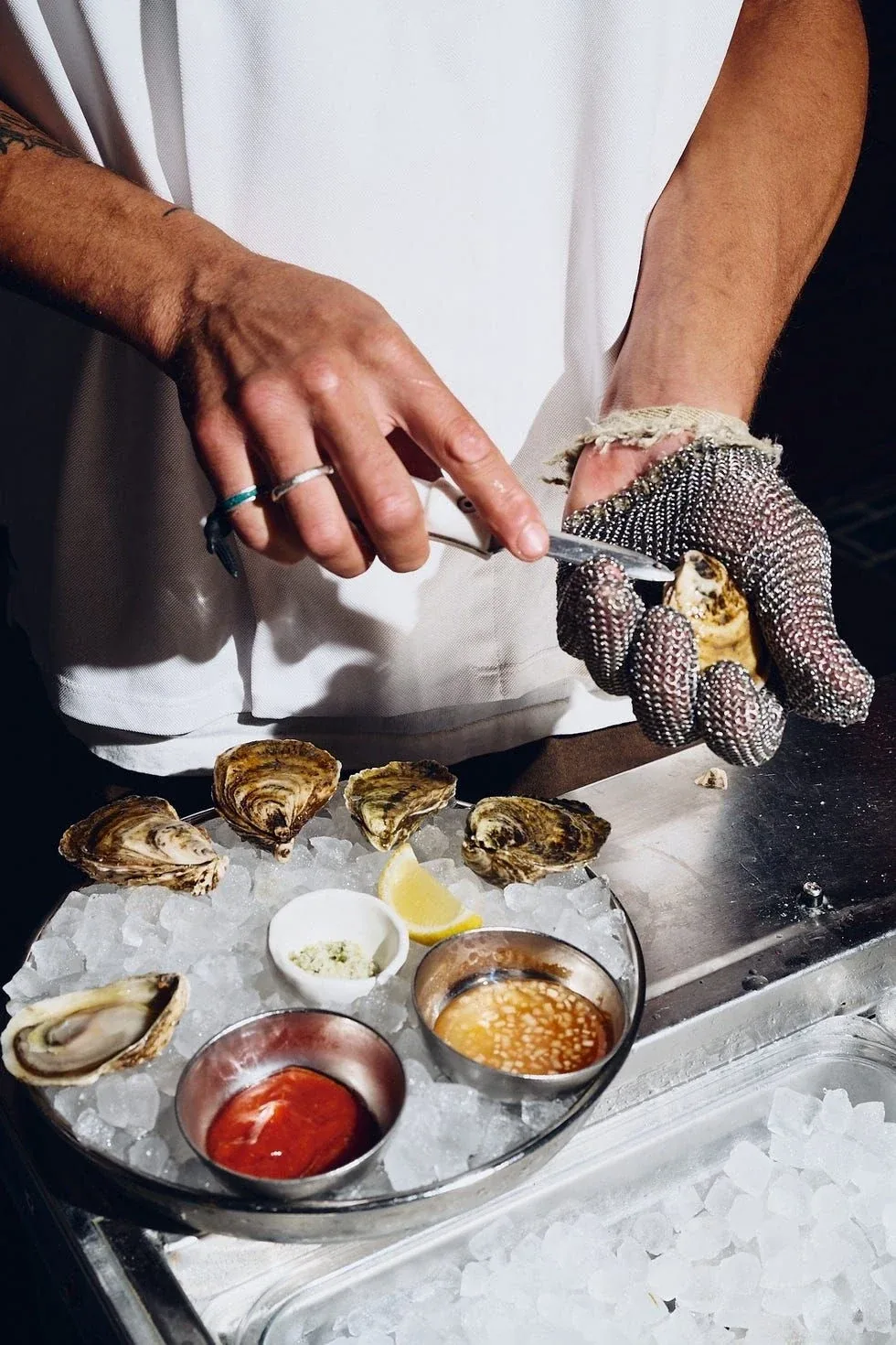
In hand
The three pots are the brand
Everything the identity says out loud comes down to what is sitting on the tray beside the ice: lime, chili, butter. The mark is inked by hand in a single weight and a single colour, so it survives being embroidered on an awning, printed on a board and stuck on a sauce sachet without ever needing a second version.