Ooh Lala
One line holds the word together
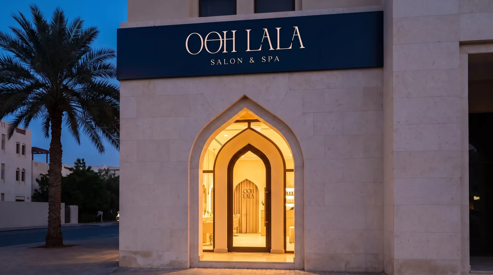
Brand identity for Ooh Lala, a salon and spa: a wordmark whose second O and H share one crossbar, a monogram set in the same arch the building is cut into, two colour pairs, a diagonal seal, and the whole system built out across signage, blind-embossed print, textiles, packaging and the room itself.
One line runs through the second O and the H, and holds the whole word together.
The brief
A cut that holds its shape
Ooh Lala is a salon and spa whose front door is a tall lit arch in pale stone. The identity is built from two observations about that building: the arch is a container the mark can live inside, and a salon sells one clean line. So the wordmark shares a single crossbar between its second O and its H, the monogram sits in a frame whose radius is exactly half its width, and the colour system is two committed pairs rather than a palette of four.
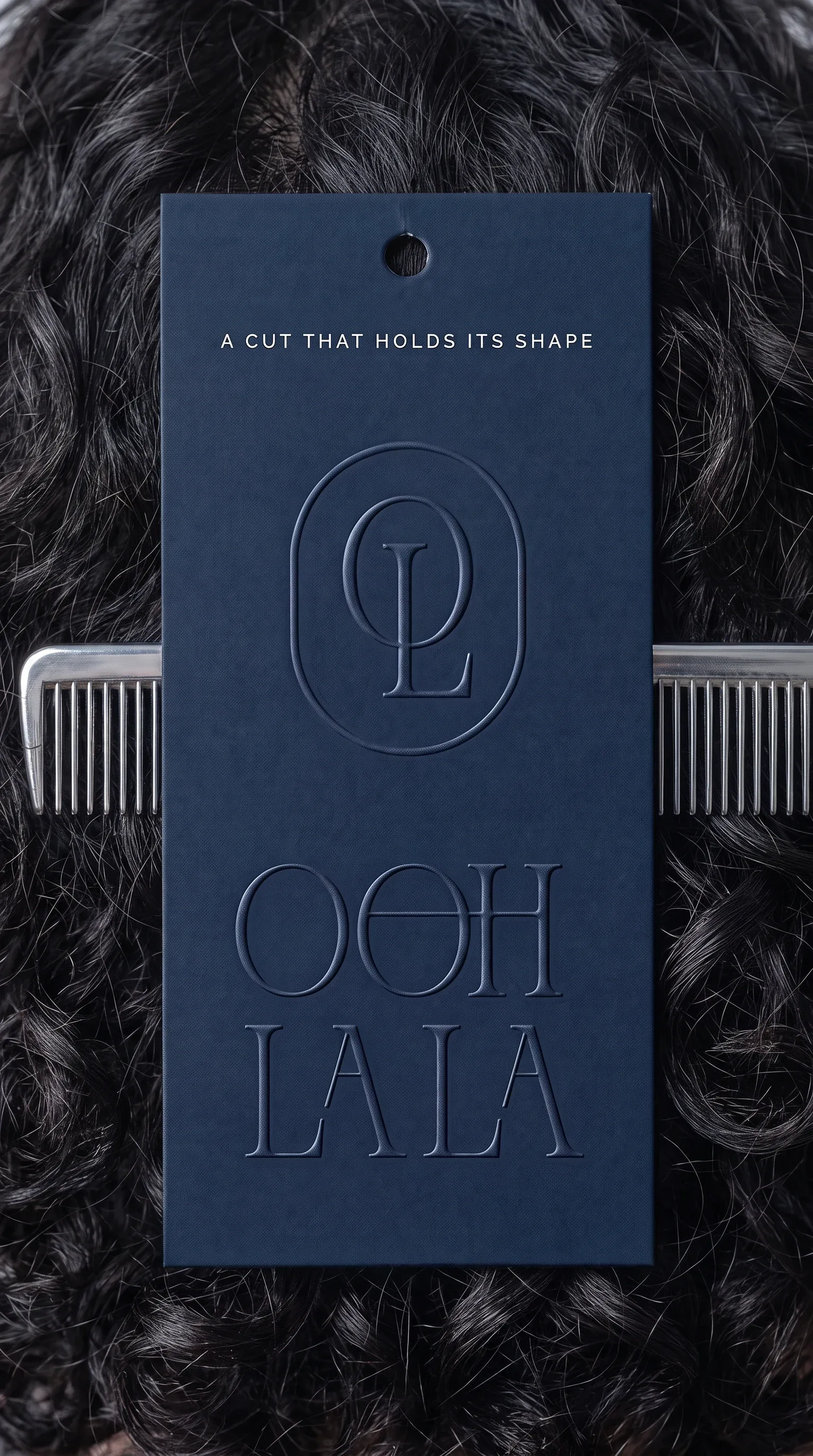
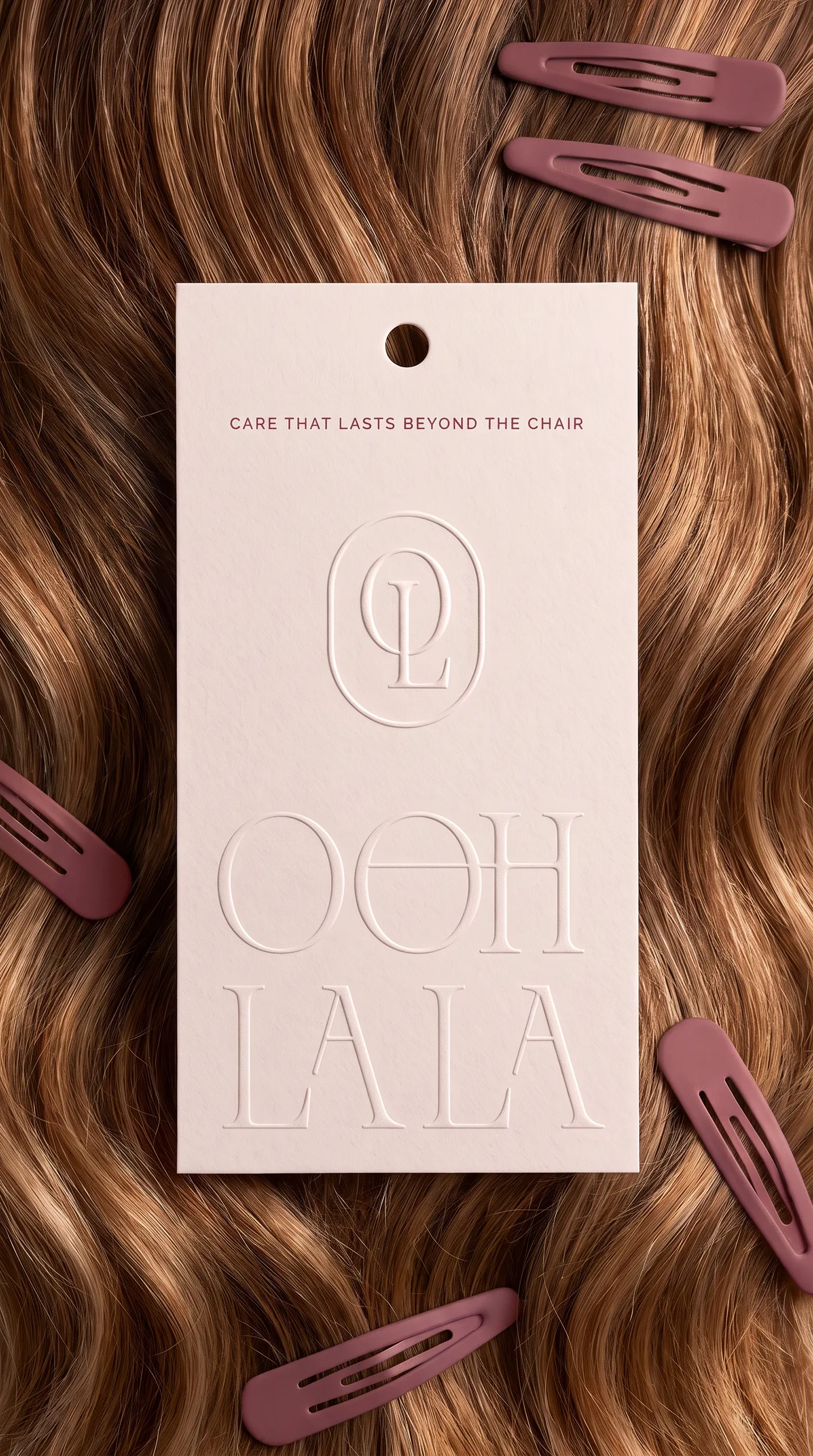
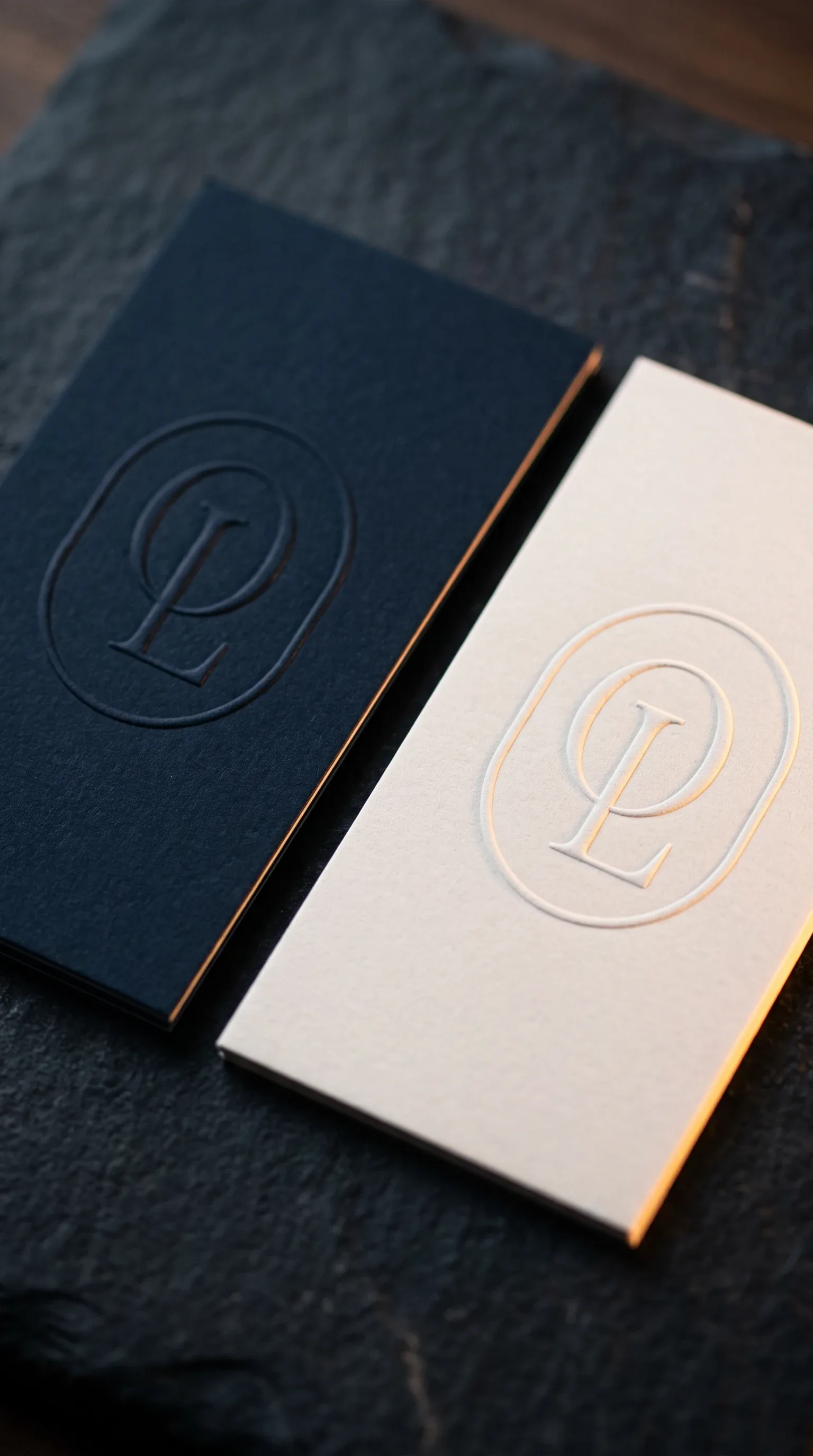
“Care that lasts beyond the chair.”
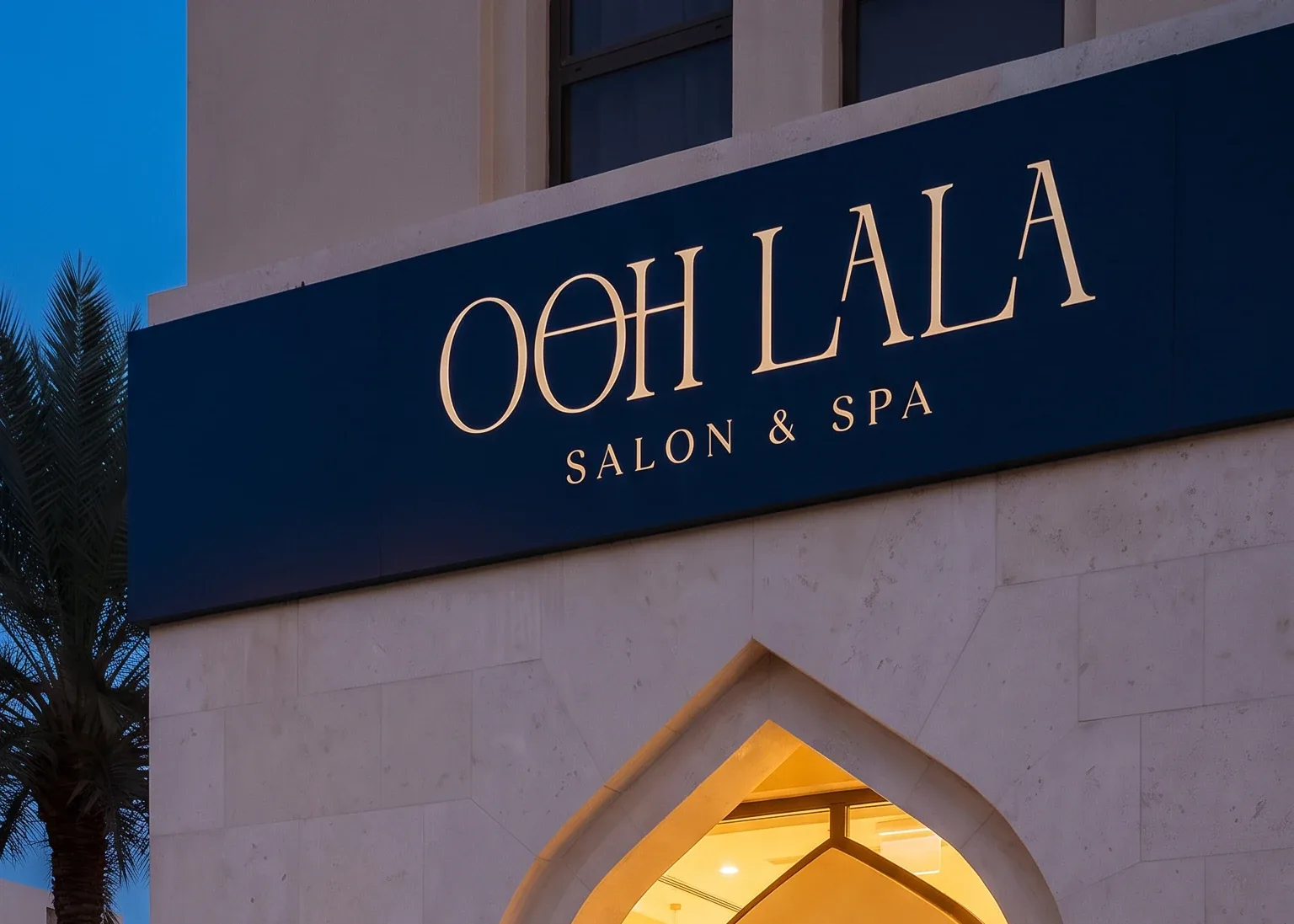 Navy
Navy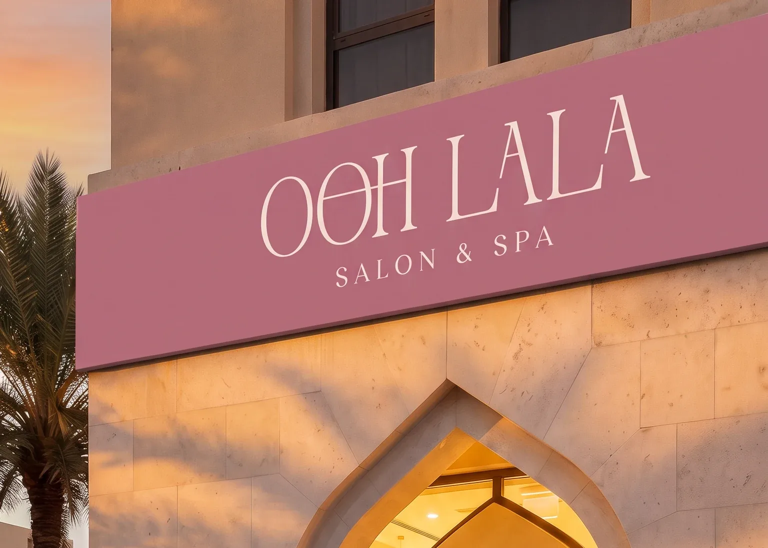 Rose
Rose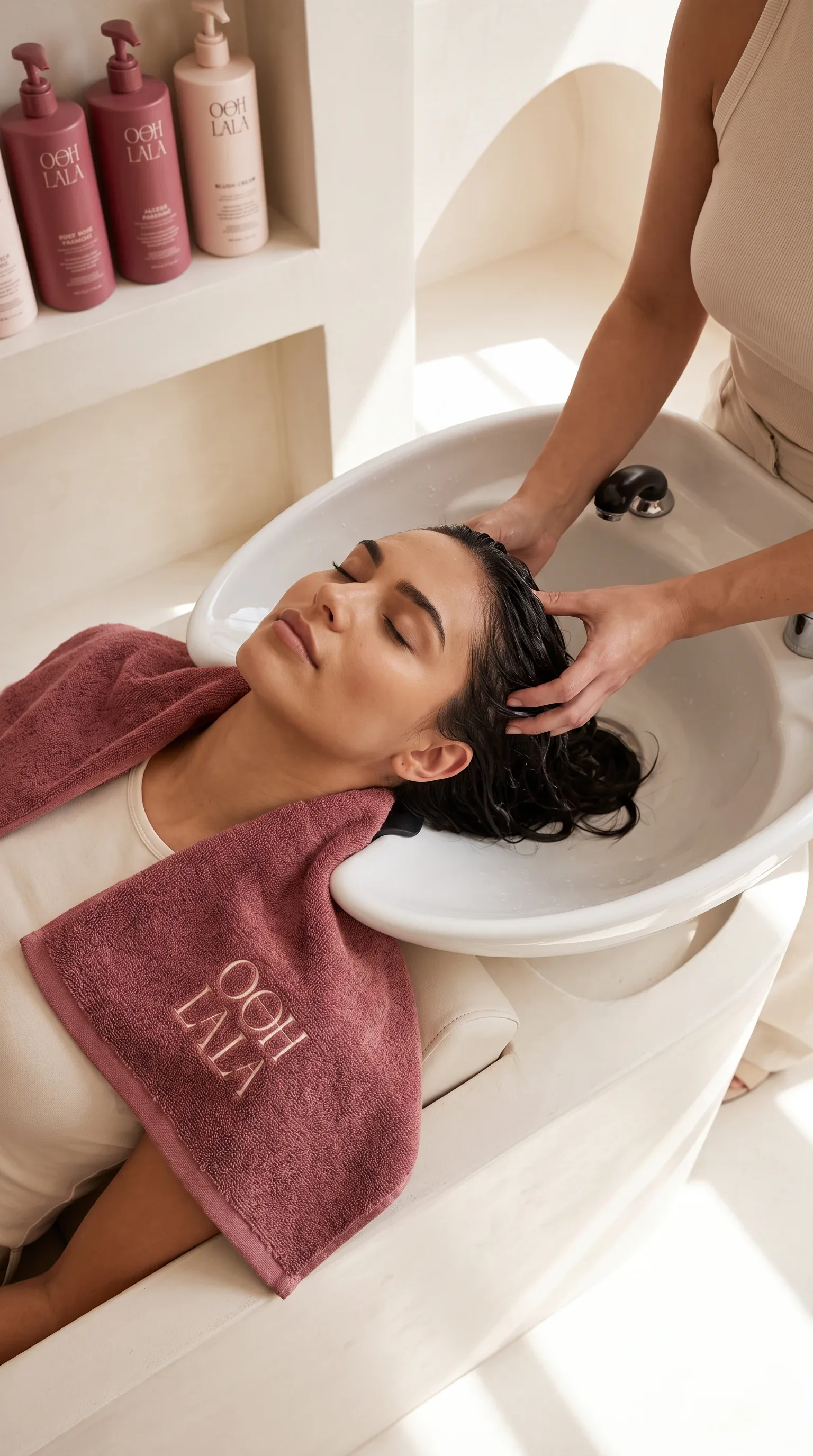
In the room
The arch again, at furniture scale
Every niche, mirror and alcove in the salon is the monogram frame at a different size, so the identity is not applied to the room, it is the room. Towels, robes and aprons carry the mark embroidered rather than printed, always in the pair the room is not wearing.